Aurelius Lab: Responding to changes.
Client
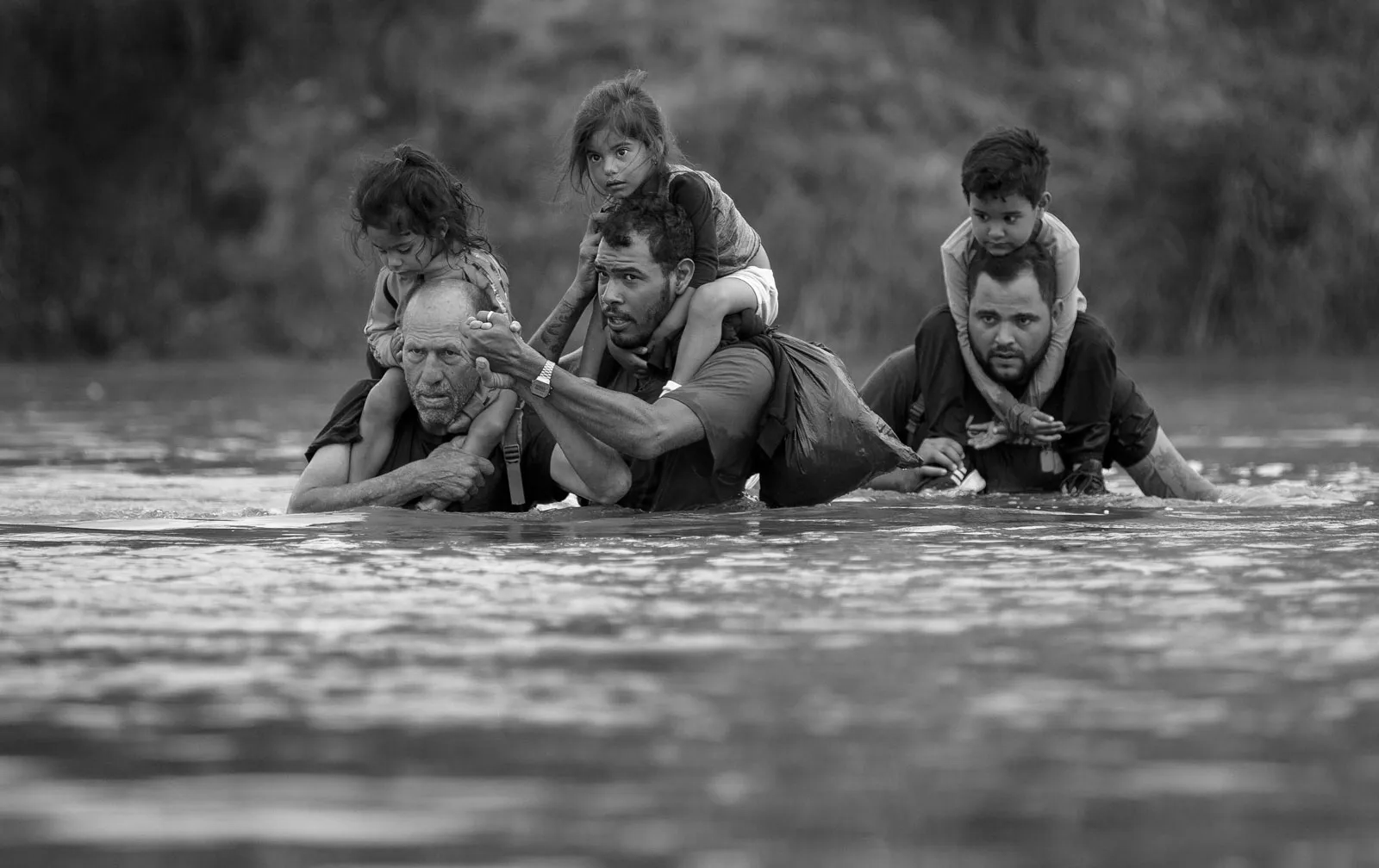
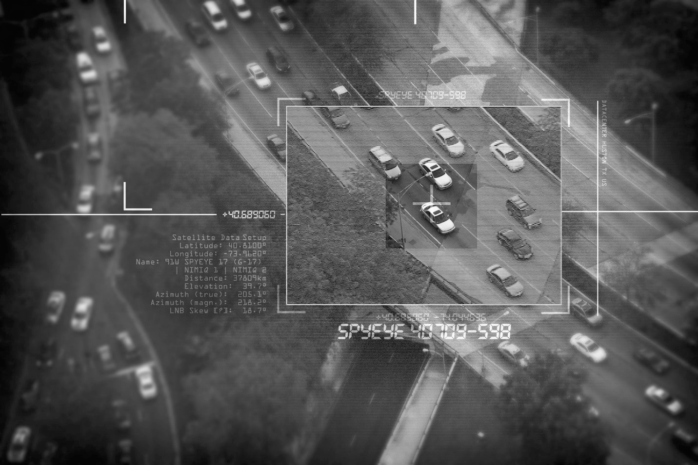
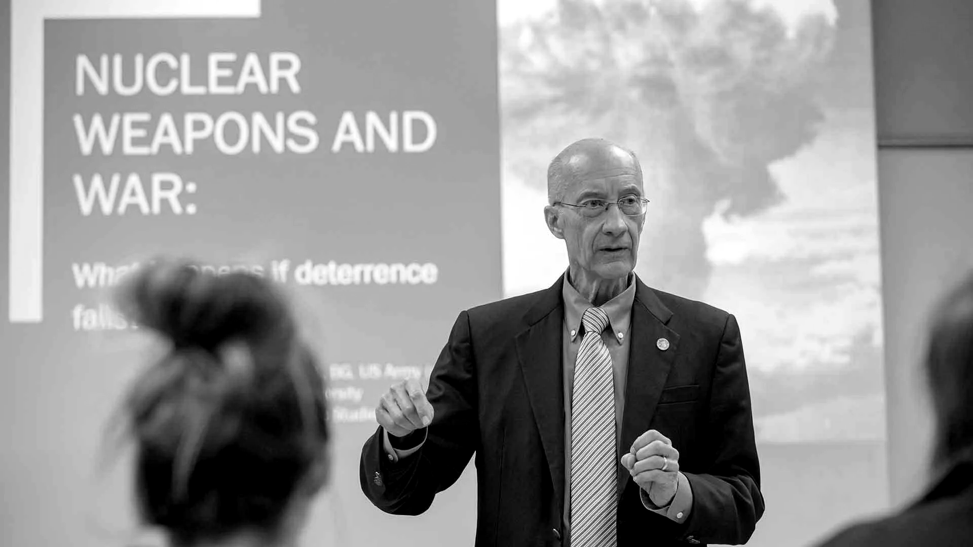
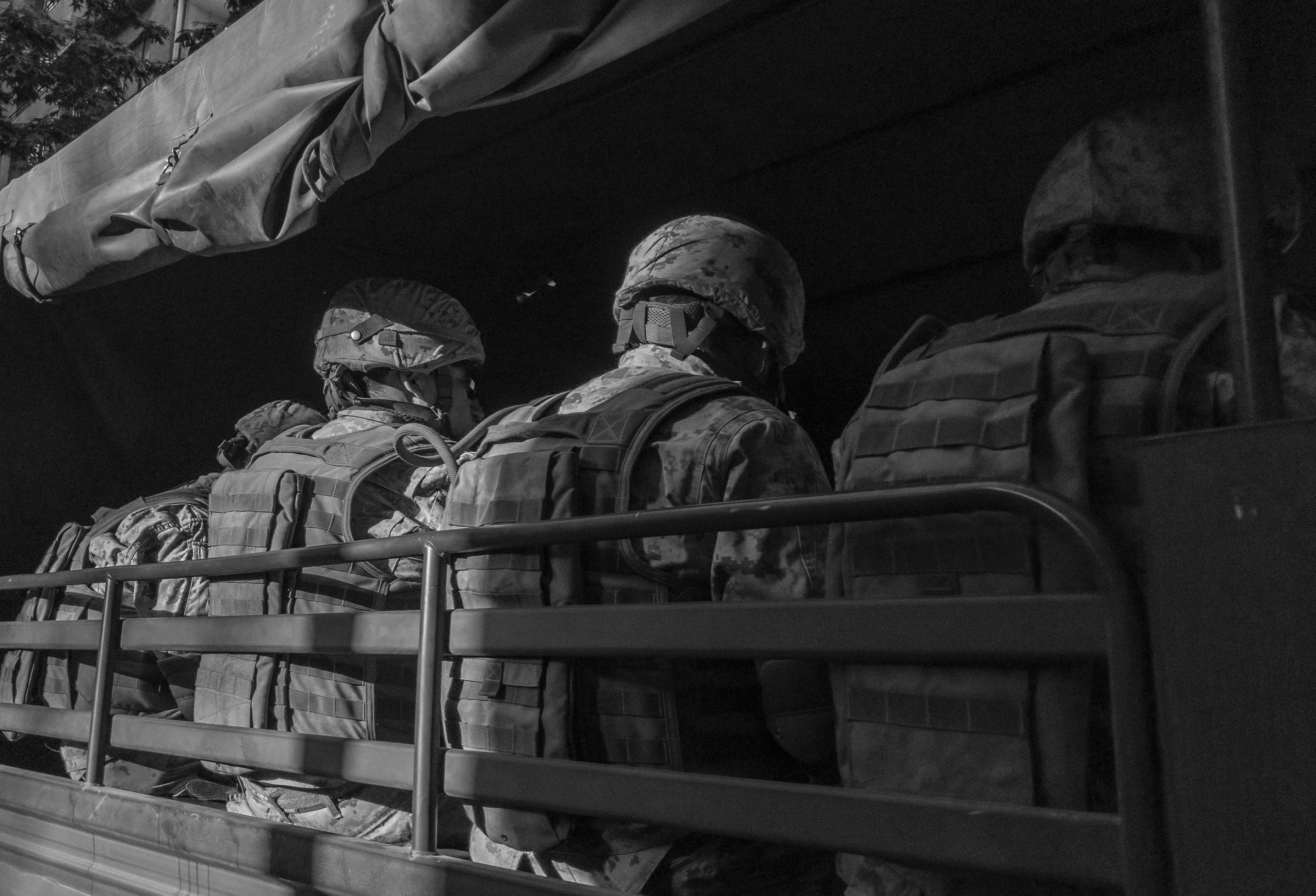
Prof. Peter Roberts — researcher at the Royal United Services Institute, studying contemporary conflict and war.
Service
Branding
Industry
Radio broadcasting and scientific activities
Links
https://aureliusthinking.com/
Prof. Peter Roberts — researcher at the Royal United Services Institute, studying contemporary conflict and war.
Service
Branding
Industry
Radio broadcasting and scientific activities
Links
https://aureliusthinking.com/
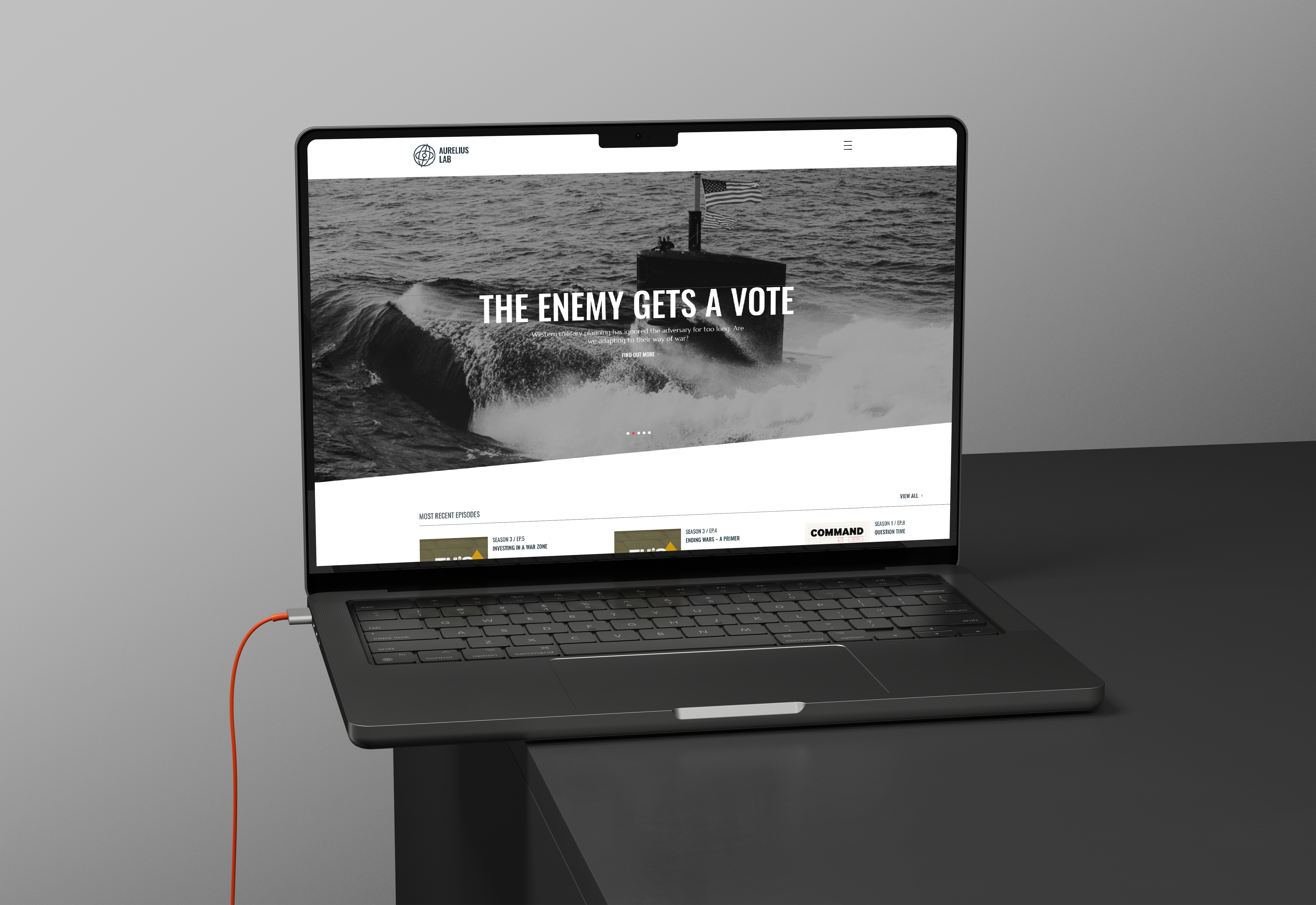
Aurelius Lab is a global player in the national security sector that offers digital media and consulting services on tactics, operational art and strategy.They aim to establish a compelling brand identity aligned with their business goals that personifies their ethos, philosophy, and various outputs The company's brand values include disruptive thinking, knowledge sharing, real-time perspectives on war, critical thinking, foresight, intellect, deeper understanding, convening power, and trust. The target audience includes military and political staff from juniors to the most senior levels. The objective is to develop a cohesive brand identity that distinguishes Aurelius Lab in the global national security landscape.

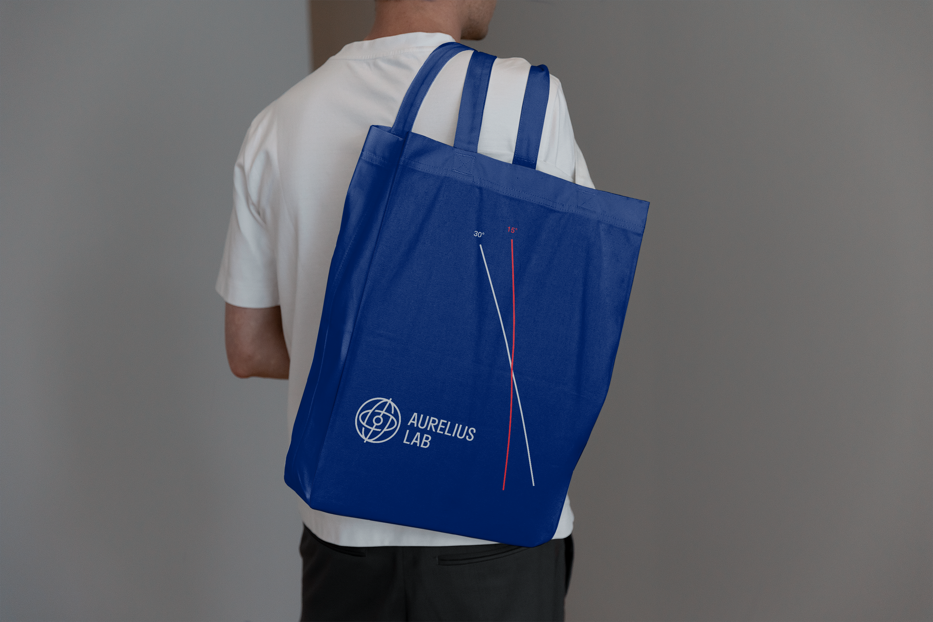
The concept is inspired by the gyroscope, symbolising constant, adaptive movement, reflecting different viewpoints. It focuses on looking at things from all angles, using clear thinking, and embracing different opinions. The gyroscope symbol in Aurelius Lab's logo represents this concept.

Aurelius Lab's visual identity is characterised by an adaptable grid based on a gyroscope's structure. This graphic device can be employed to create typography layouts, photography and image layouts, and even to showcase contrasting perspectives and juxtapositions.


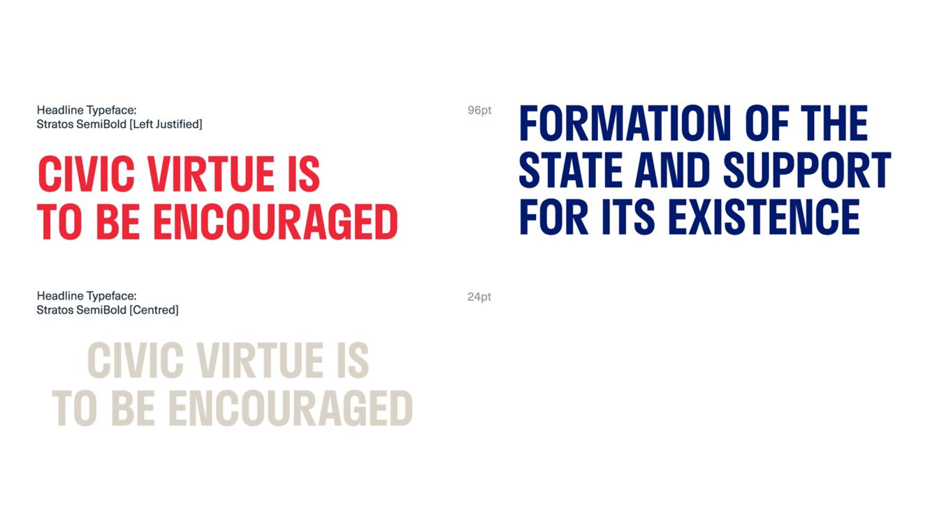
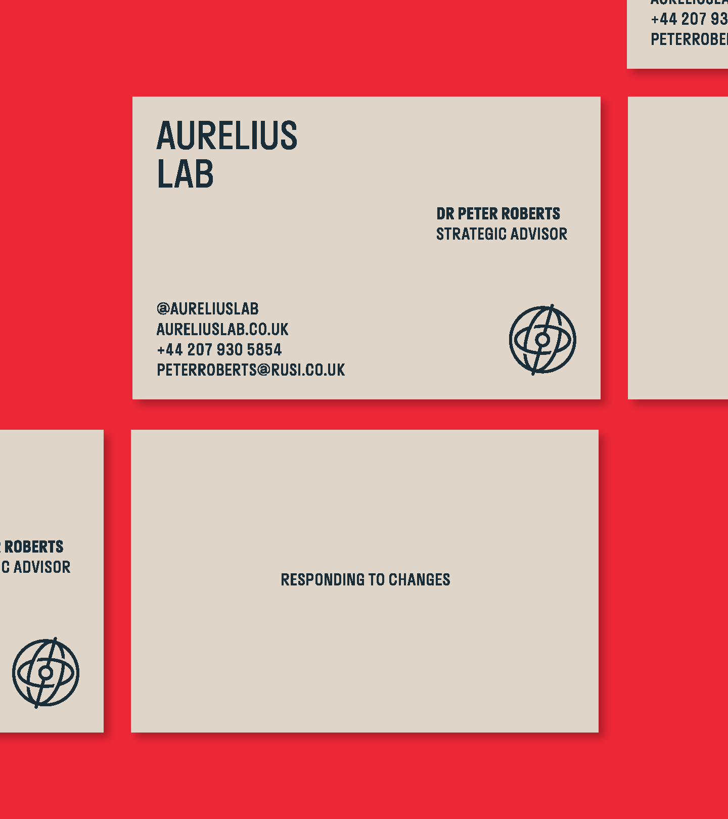
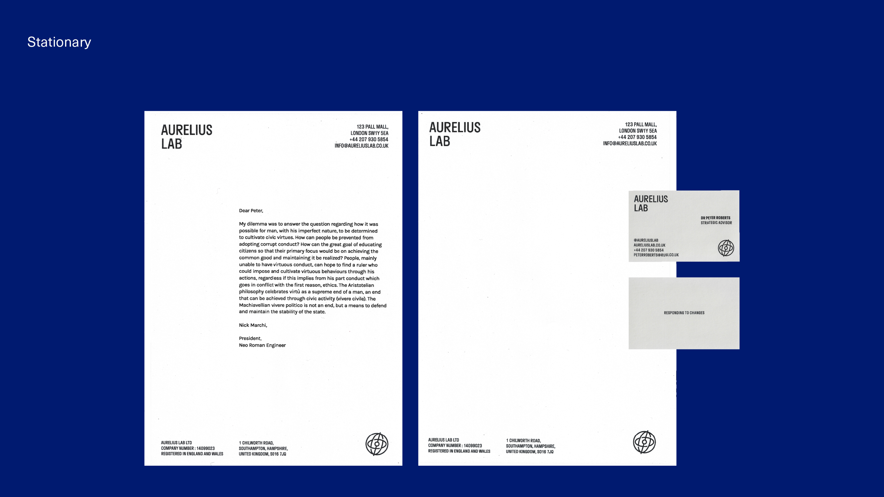
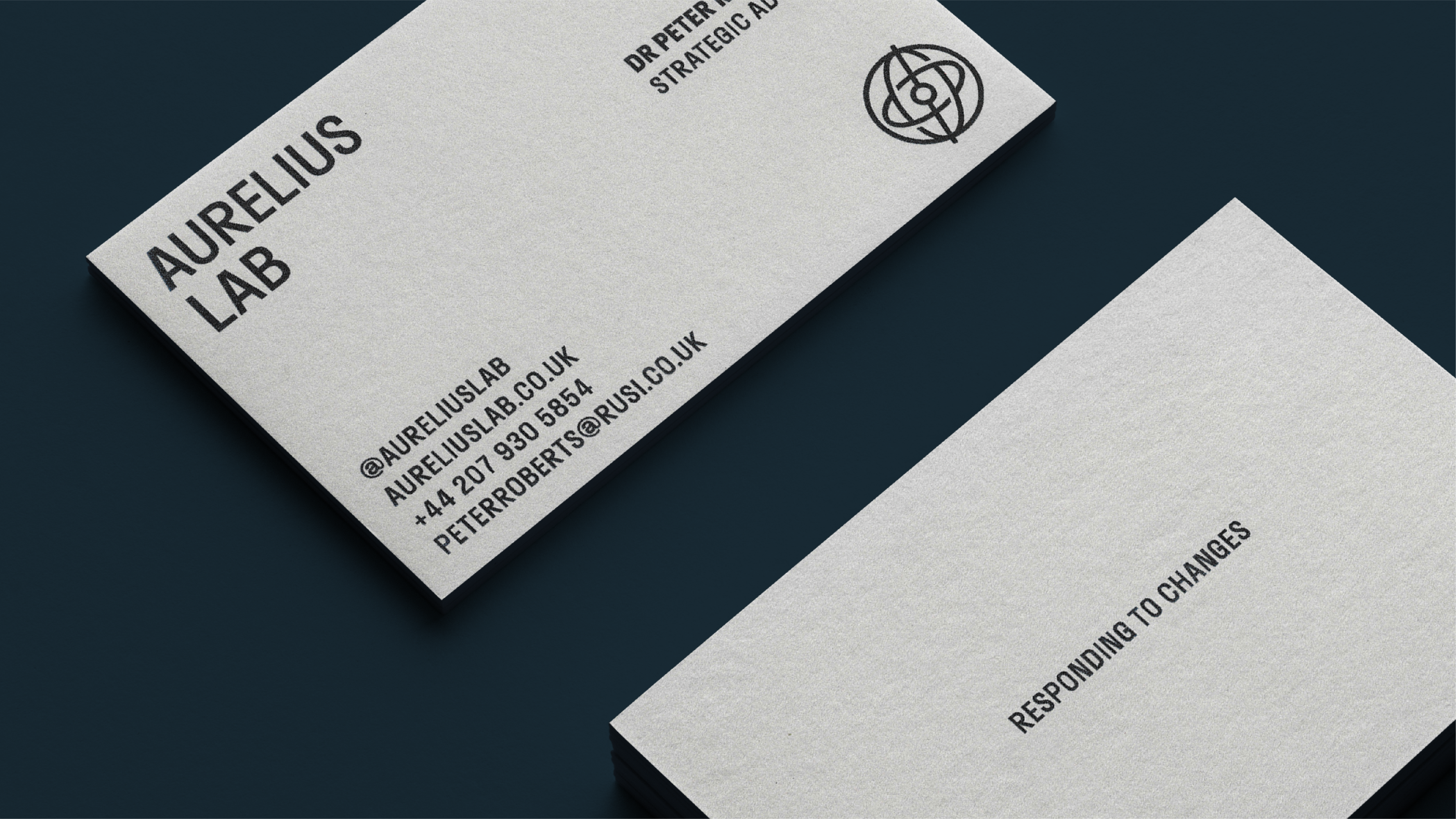

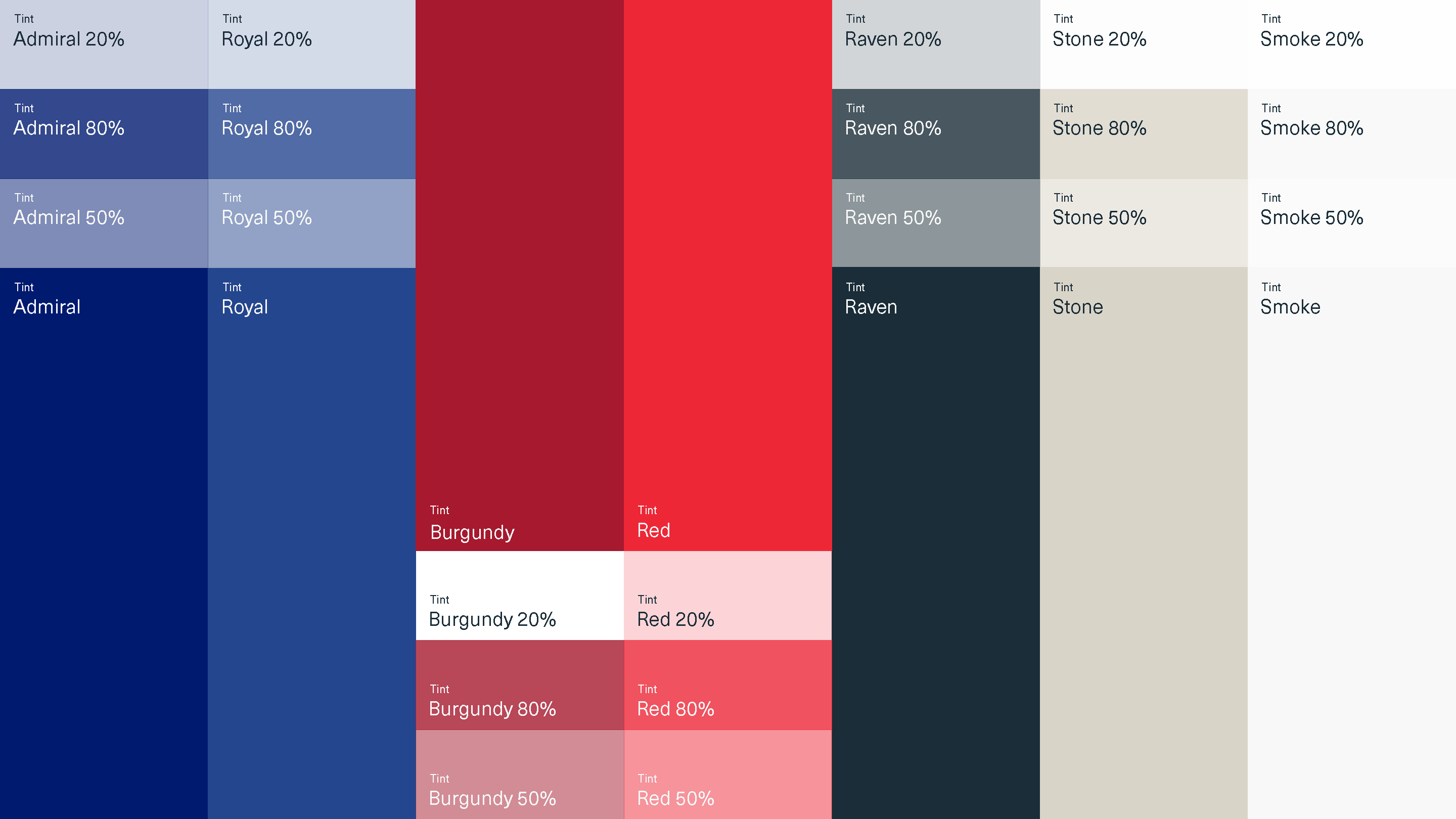
We use a combination of red and blue colours to represent the group's innovative and expert approach to national security. Blue represents trust and reliability, while red represents energy and readiness to take action.

Seized: Compulsive Beauty.

Service
Graphic Design, Photography
Industry
Editorial, Photography
Graphic Design, Photography
Industry
Editorial, Photography
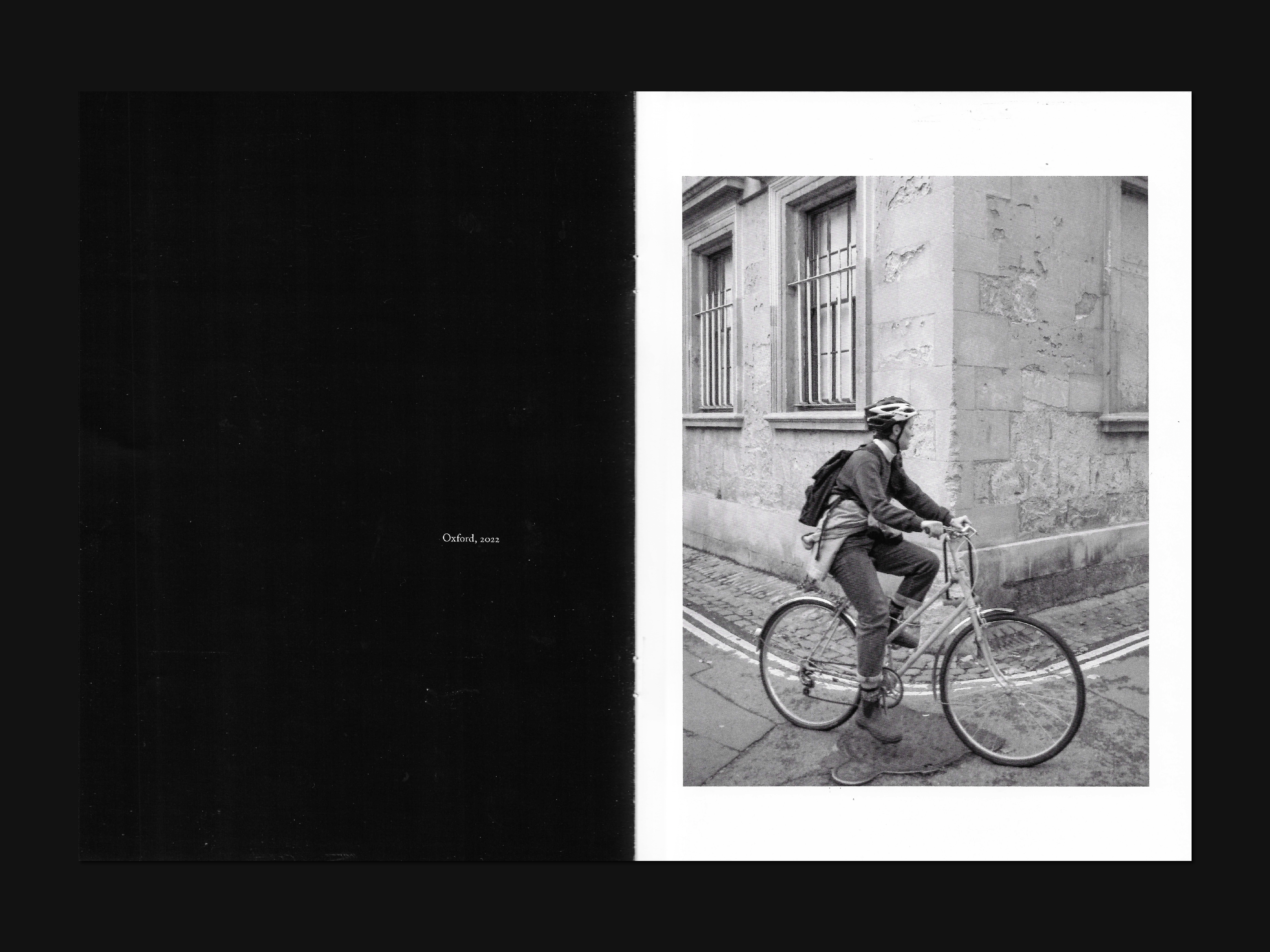
Seized is a self-published photography zine that focuses on a research approach, exploring the Surrealist concept of "Convulsive beauty" through black and white street photography. Andre Breton defined "Convulsive beauty" as a veiled-erotic, fixed-explosive, and magical-circumstantial idea.
The magazine's theme is rather sensitive, so it was important not to lose this sensuality during printing. Therefore, I decided that silk for the inner pages and silk with Soft Touch lamination for the cover would be excellent choices to convey this vulnerable human nature.
Print Specs:
176mm x 250mm
Staple, Full-colour printing, 20 pages, 150gsm Silk
Full-colour printing (front and back), Soft-Touch Lamination (outside), 350gsm Silk
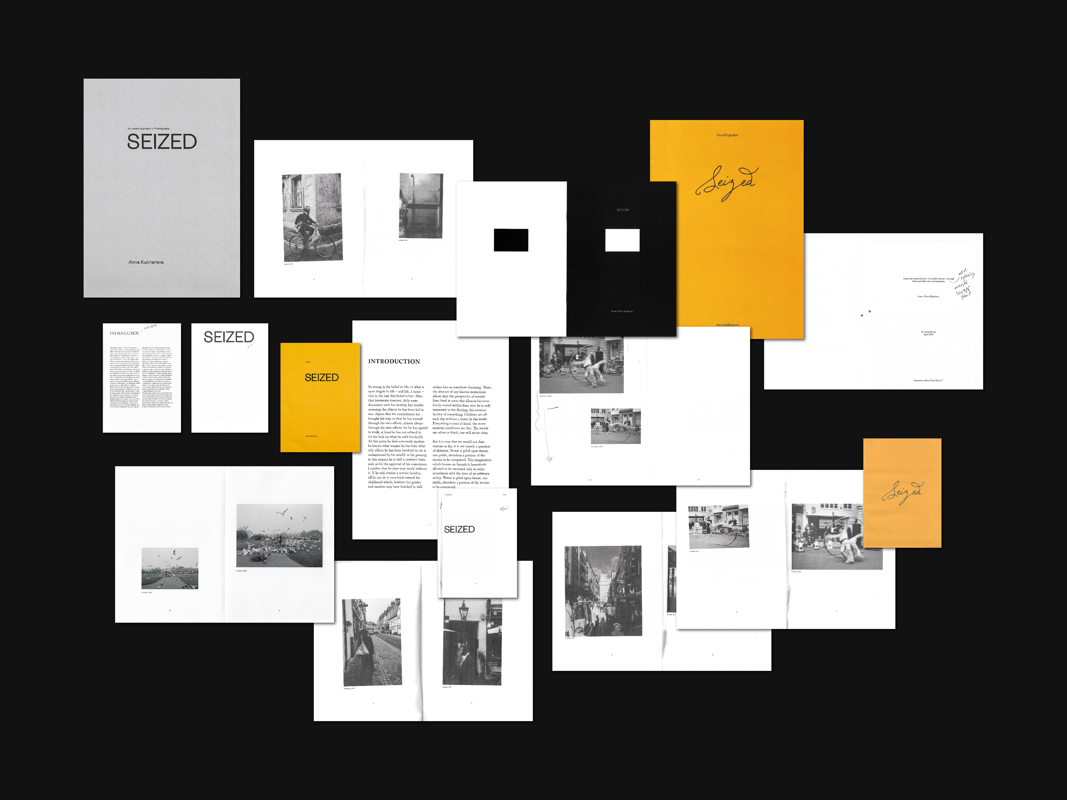
Deciding on the right format for a project can be a challenging task. Both A5 and A4 have their limitations, and it's crucial to find a format that highlights photographs while still maintaining their intimate feel. After careful consideration, I opted for B5 as it perfectly showcased all the images while preserving their intimate feel.
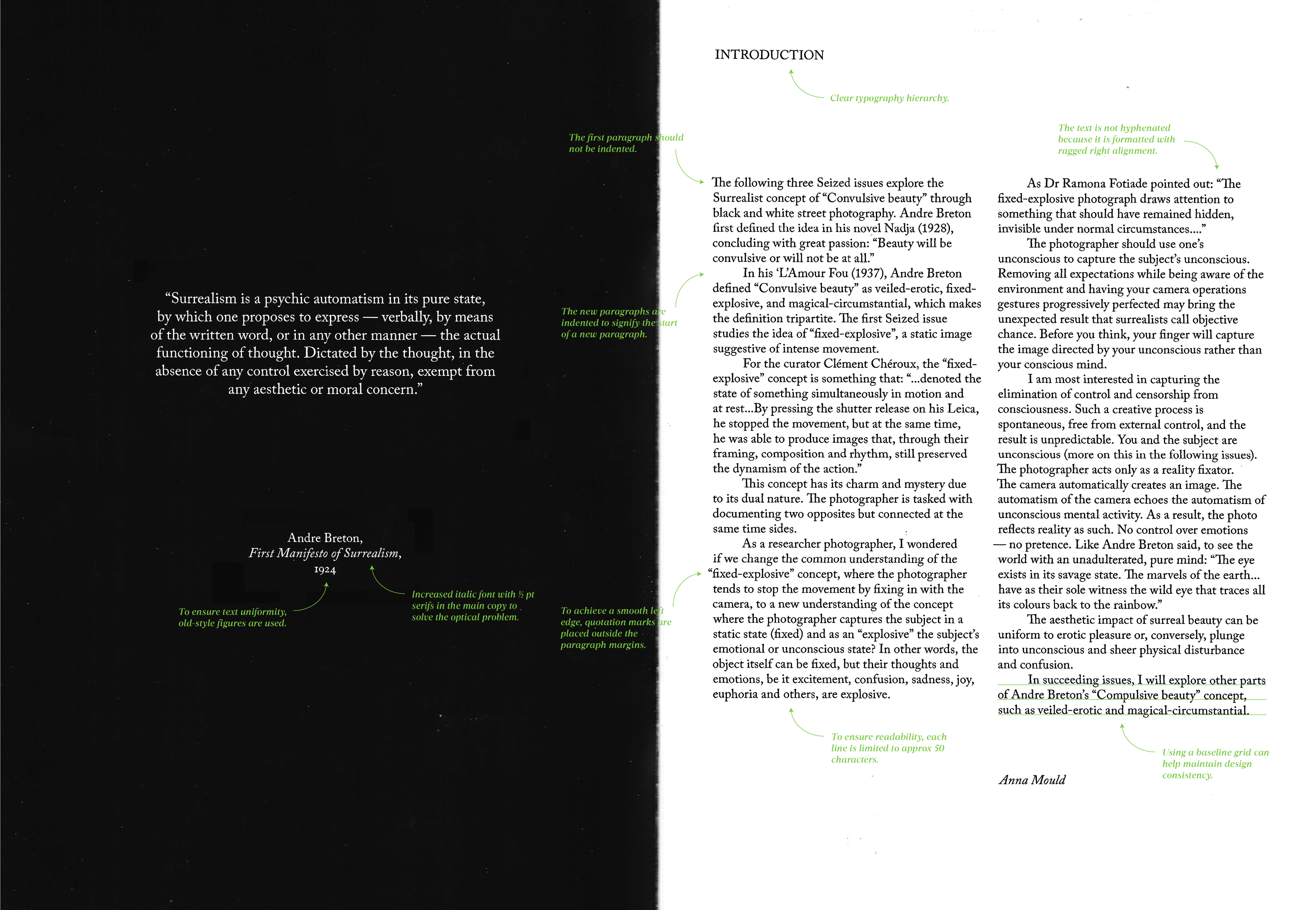
When it came to selecting a typeface, I was looking for a font that exuded warmth, class, and confidence. After experimenting with various options, I settled on Adobe Caslon Pro, which was perfect for publications and offered a suitable range of weights. This chosen typeface was used consistently throughout the entire layout.
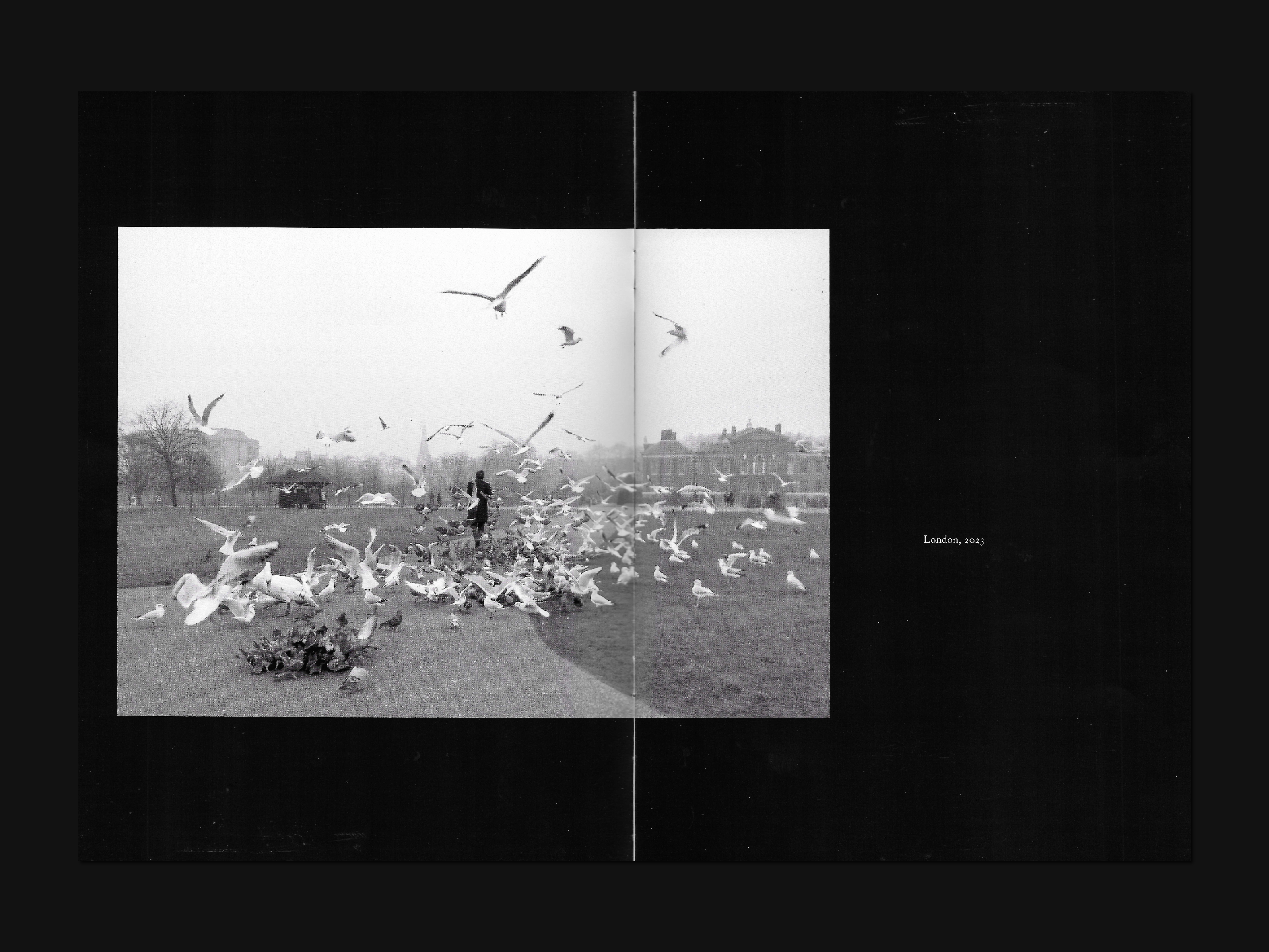
To emphasize a particular emotion, I deliberately arranged one photo per page. Some photos were also allowed to occupy part of the second page to add some breathing room to the layout and to guide the viewer's attention to the most important details of the image or area.
When it came to selecting a typeface, I was looking for a font that exuded warmth, class, and confidence. After experimenting with various options, I settled on Adobe Caslon Pro, which was perfect for publications and offered a suitable range of weights. This chosen typeface was used consistently throughout the entire layout.
To emphasize a particular emotion, I deliberately arranged one photo per page. Some photos were also allowed to occupy part of the second page to add some breathing room to the layout and to guide the viewer's attention to the most important details of the image or area.
For the cover, I wanted to maintain a minimalist approach to avoid any unnecessary distractions and to focus on the key aspect of capturing emotions. Initially, I had planned to use a warm yellow colour to highlight the sensitivity of the topic. However, I ultimately decided to eliminate the use of colour entirely and instead adopt a black-and-white approach, which was also chosen for the photographs themselves. As Henri Cartier-Bresson once stated in an interview with Le Monde, "I find emotion in black and white: it transposes, it is an abstraction, it is not the norm. Reality is like a chaotic deluge, and within this reality, one must make choices that bring form and content together in a balanced way."
After conducting multiple explorations and trials, I finally found what I was looking for in terms of the cover, typography, layout, and colour profile. These choices effectively conveyed the essence of the magazine in the best possible way.
After conducting multiple explorations and trials, I finally found what I was looking for in terms of the cover, typography, layout, and colour profile. These choices effectively conveyed the essence of the magazine in the best possible way.

Issue 1: Fixed-Explosive.
First Seized issue focuses on the "fixed-explosive" concept, where a static image suggests intense movement. The goal is to capture the subject in a static state while also revealing their emotional or unconscious state. By removing control and censorship from consciousness, we allow for a spontaneous and unpredictable creative process.
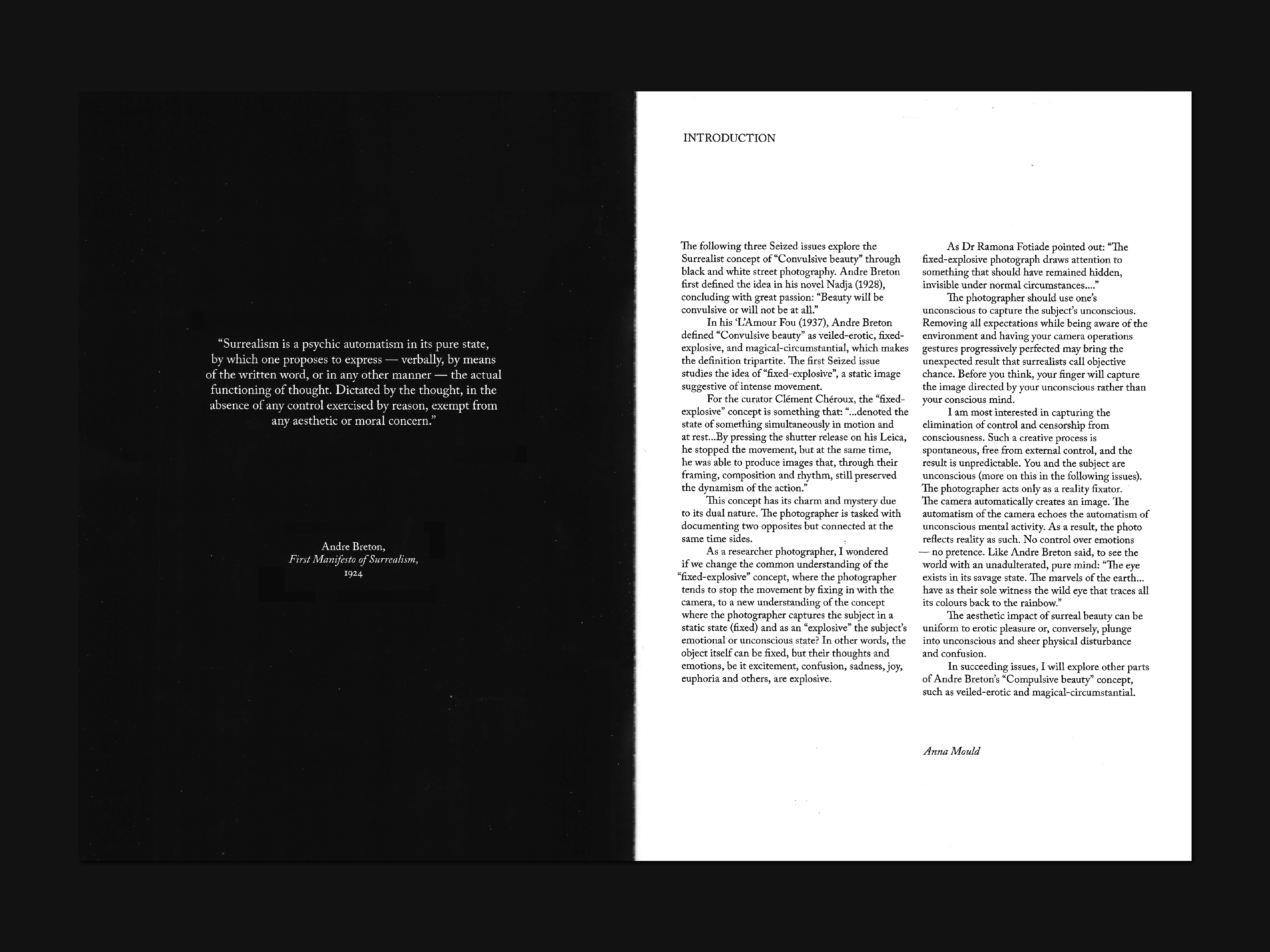


In succeeding issues, I will explore other parts of Andre Breton’s “Compulsive beauty” concept, such as veiled-erotic and magical-circumstantial.
The Sound Of Shambhala: Journey towards inner harmony and balanced energy.
Client
Eugenia Alexandrova
Service
Visual Identity, Photo Editing
Industry
Wellbeing
Eugenia Alexandrova
Service
Visual Identity, Photo Editing
Industry
Wellbeing
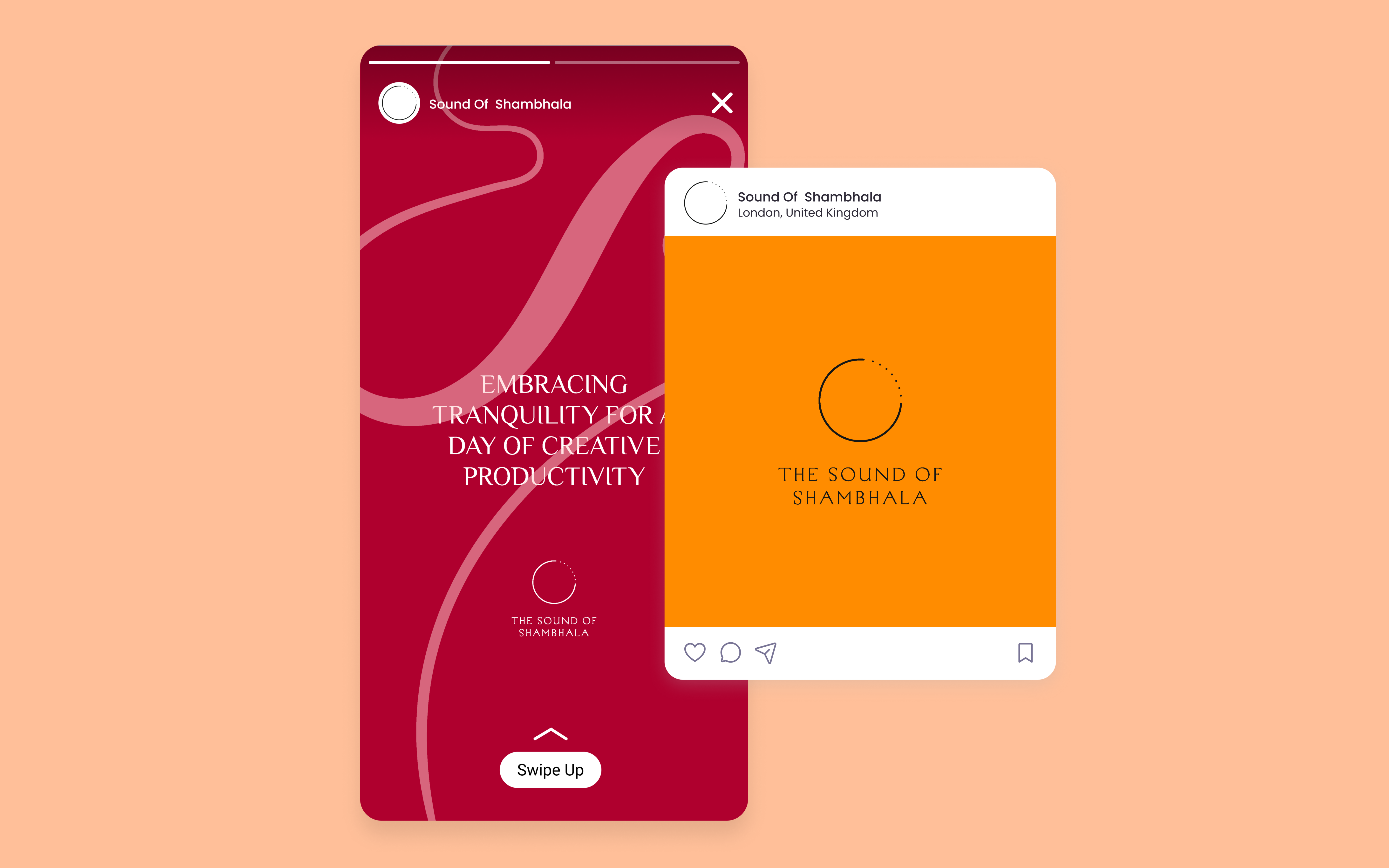
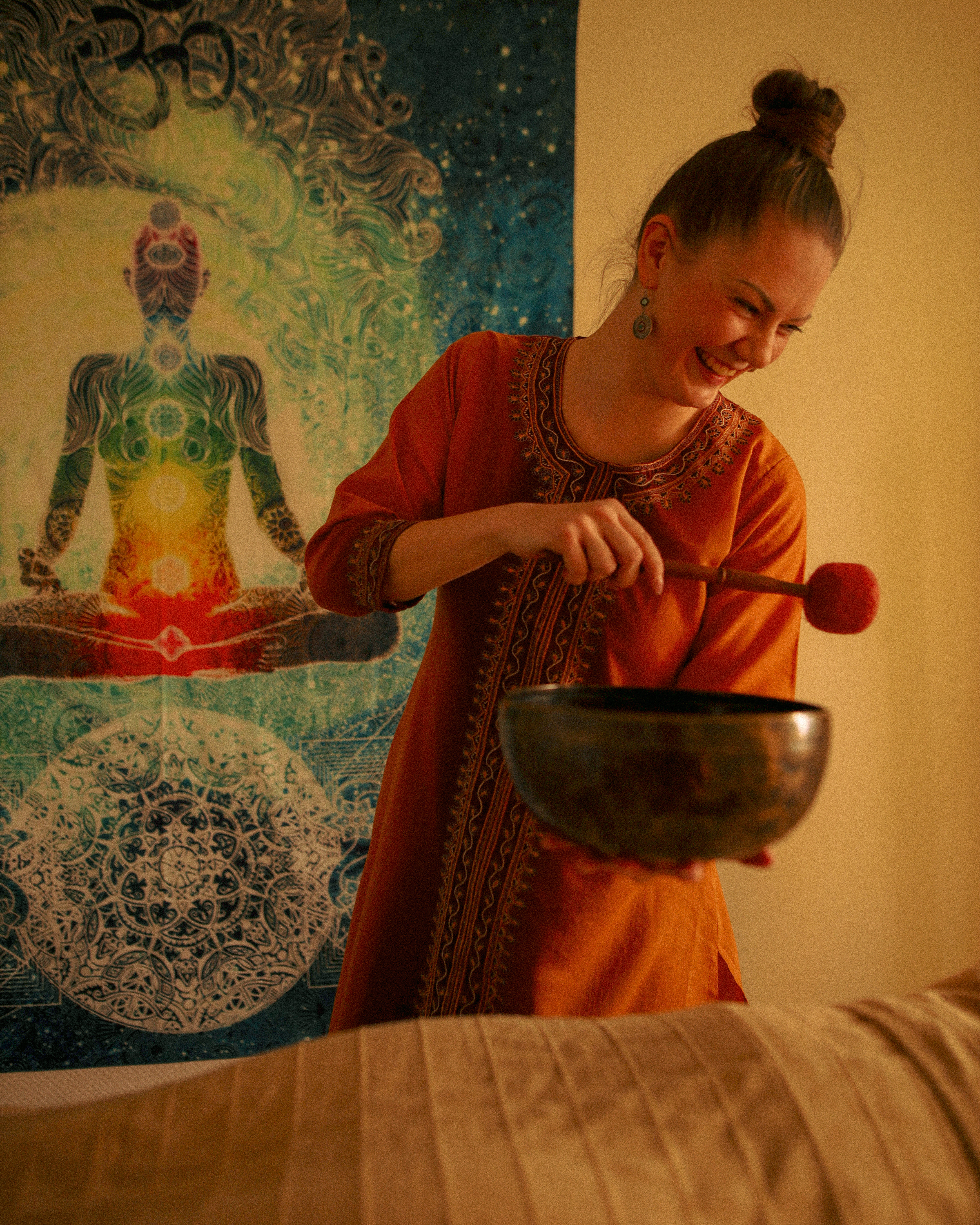
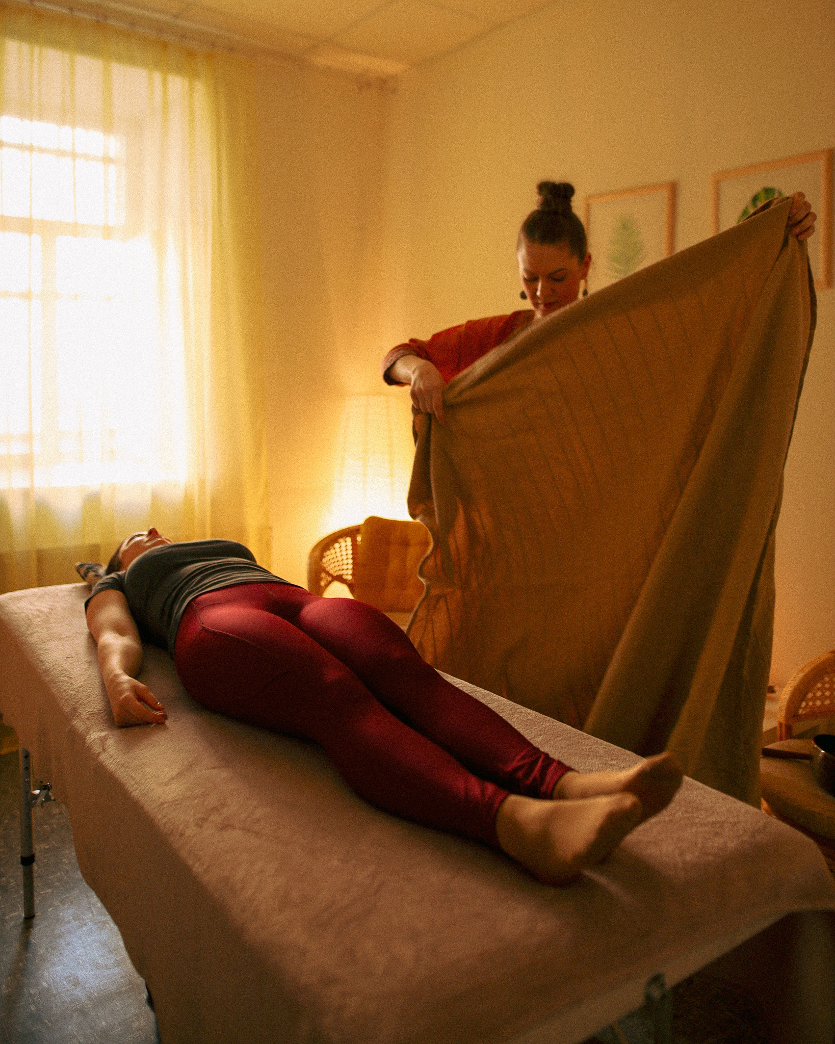
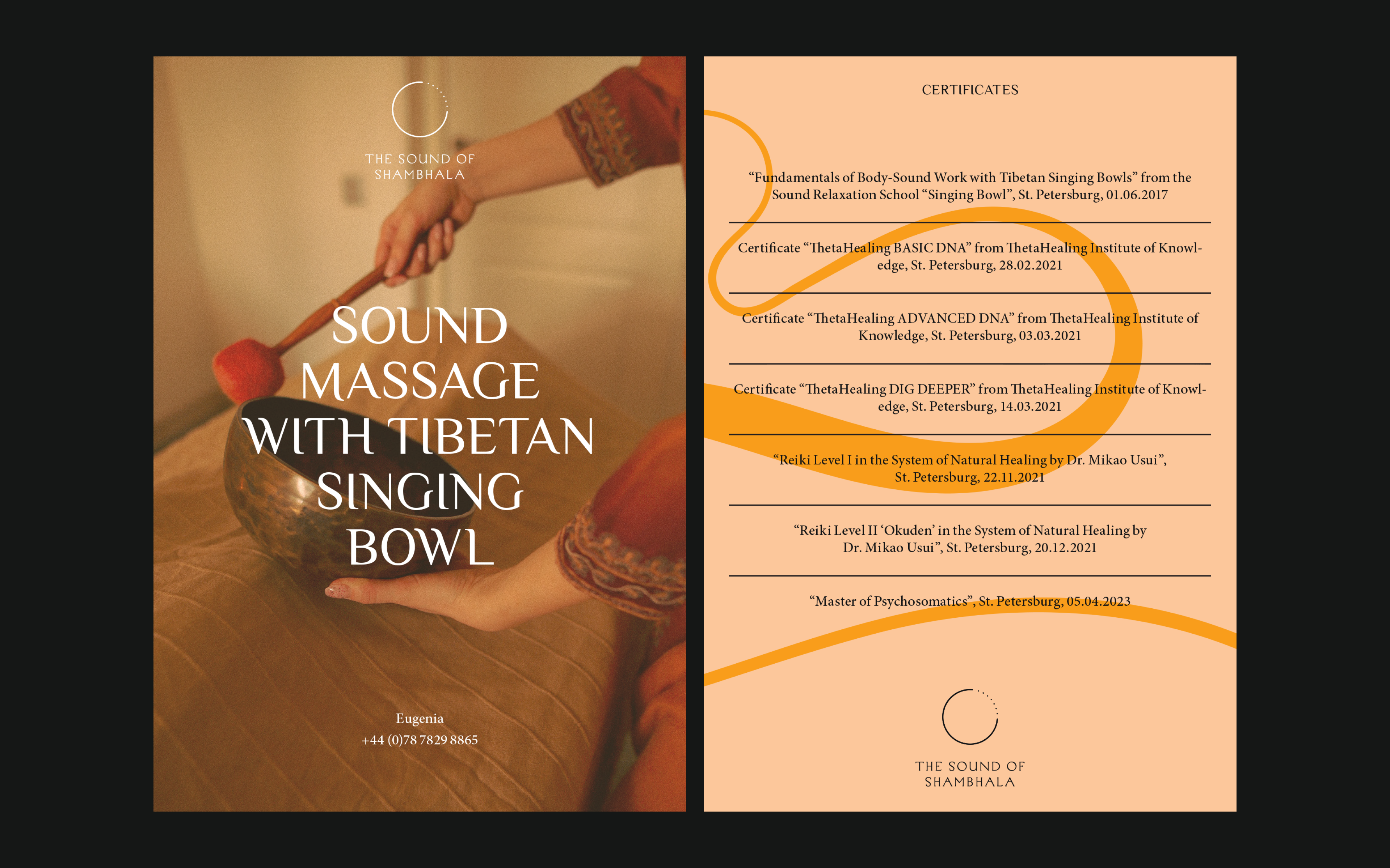
Eugenia Alexandrova, a passionate sound healing massage specialist, transitioned her hobby into a professional endeavour. She aims to provide distinctive services for open-minded individuals seeking stress relief and relaxation, focusing on women of all ages.
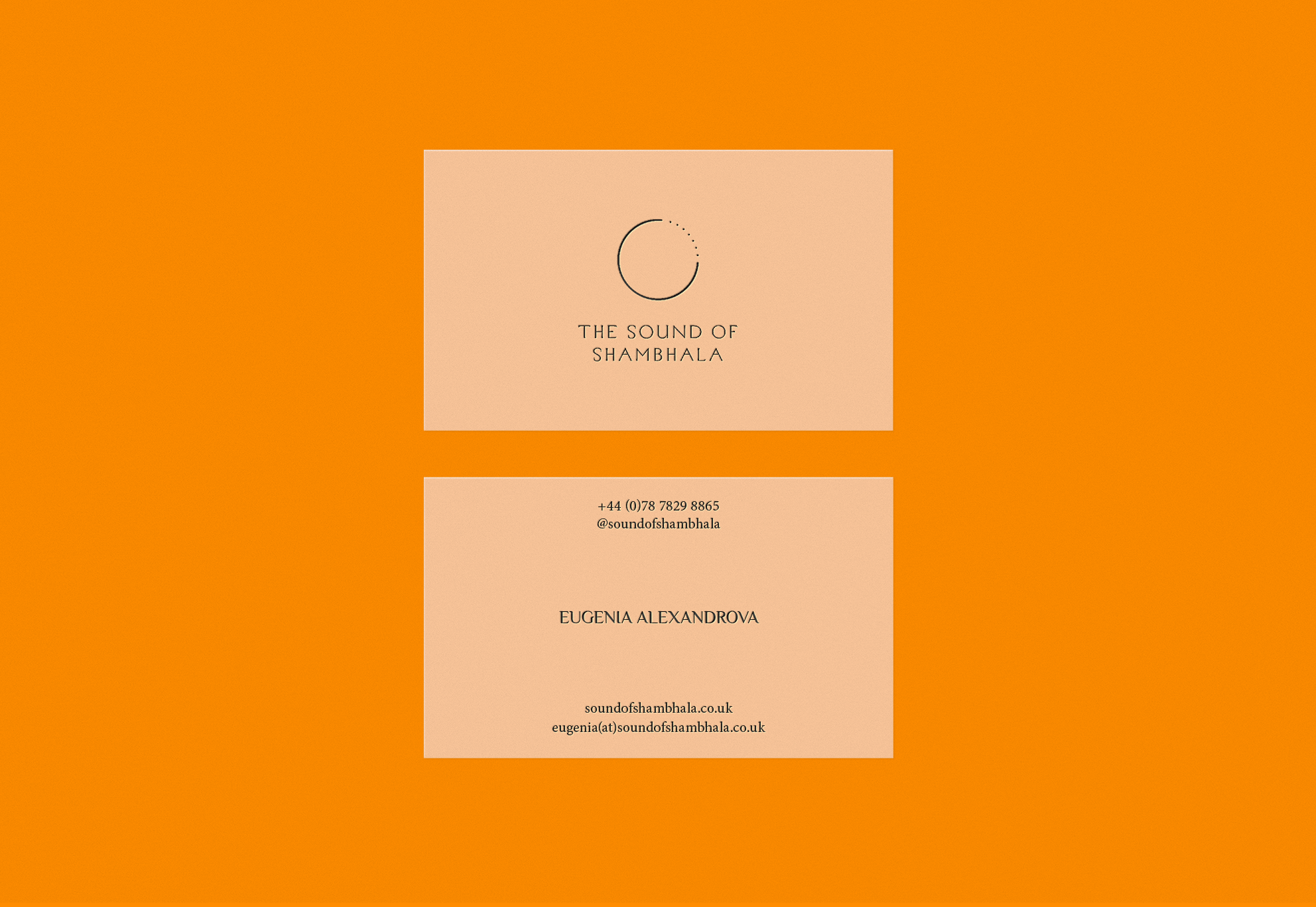
Eugenia envisions her marketing materials making an impact in noise-filled environments, reflecting her commitment to reaching her audience in diverse and energetic spaces.
A balanced visual identity was achieved through careful iterations, with a thoughtfully selected colour palette for both digital and print media. Inspired by Buddhism, the project sought to capture the interplay between mind and body through sound vibration. Wassily Kandinsky's influence added an artistic depth, symbolizing the journey towards inner equilibrium.
This project invites contemplation of balanced energy, seamlessly merging sound, movement, and spirituality. It embodies Eugenia's vision of guiding individuals towards enduring equilibrium.
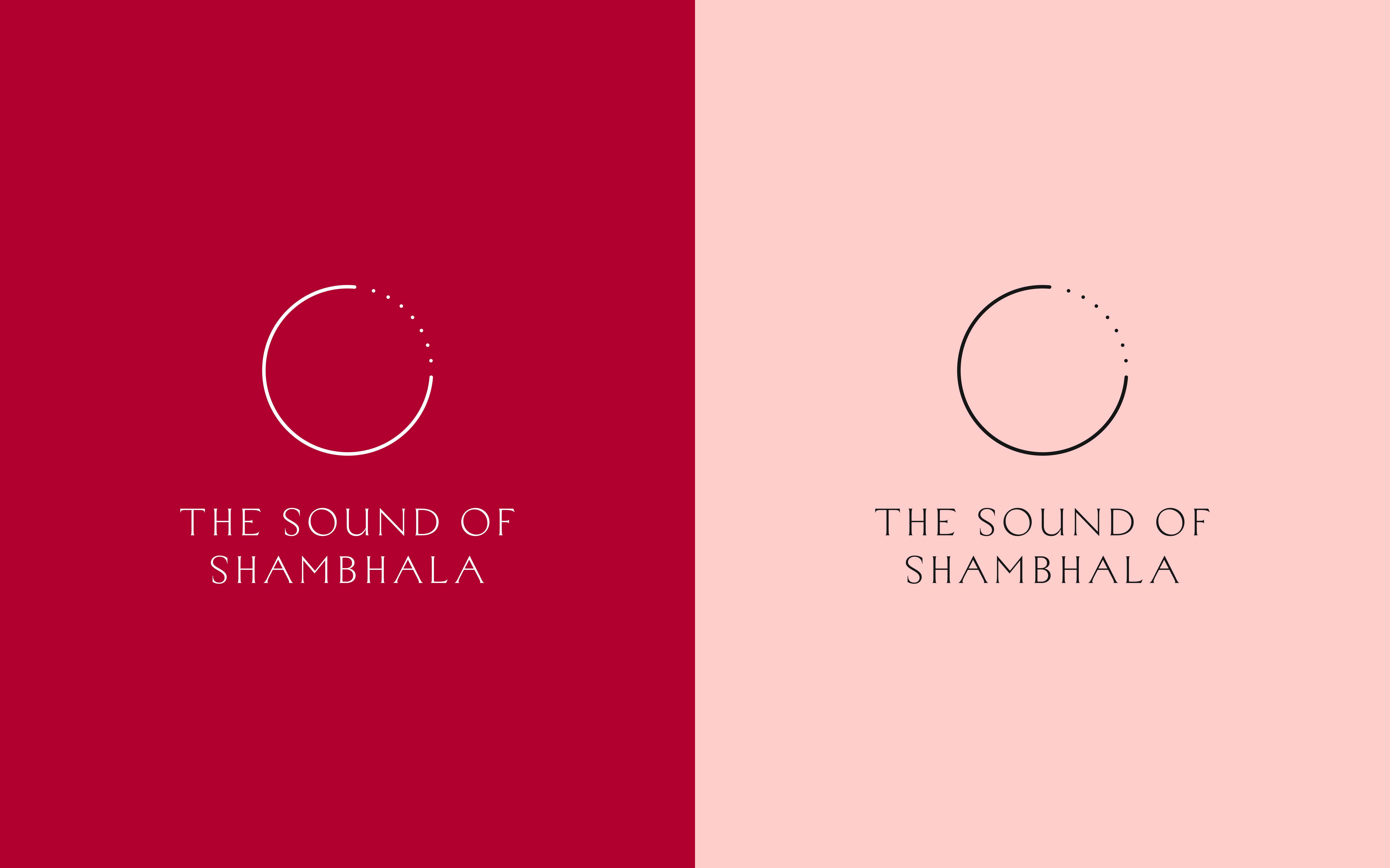

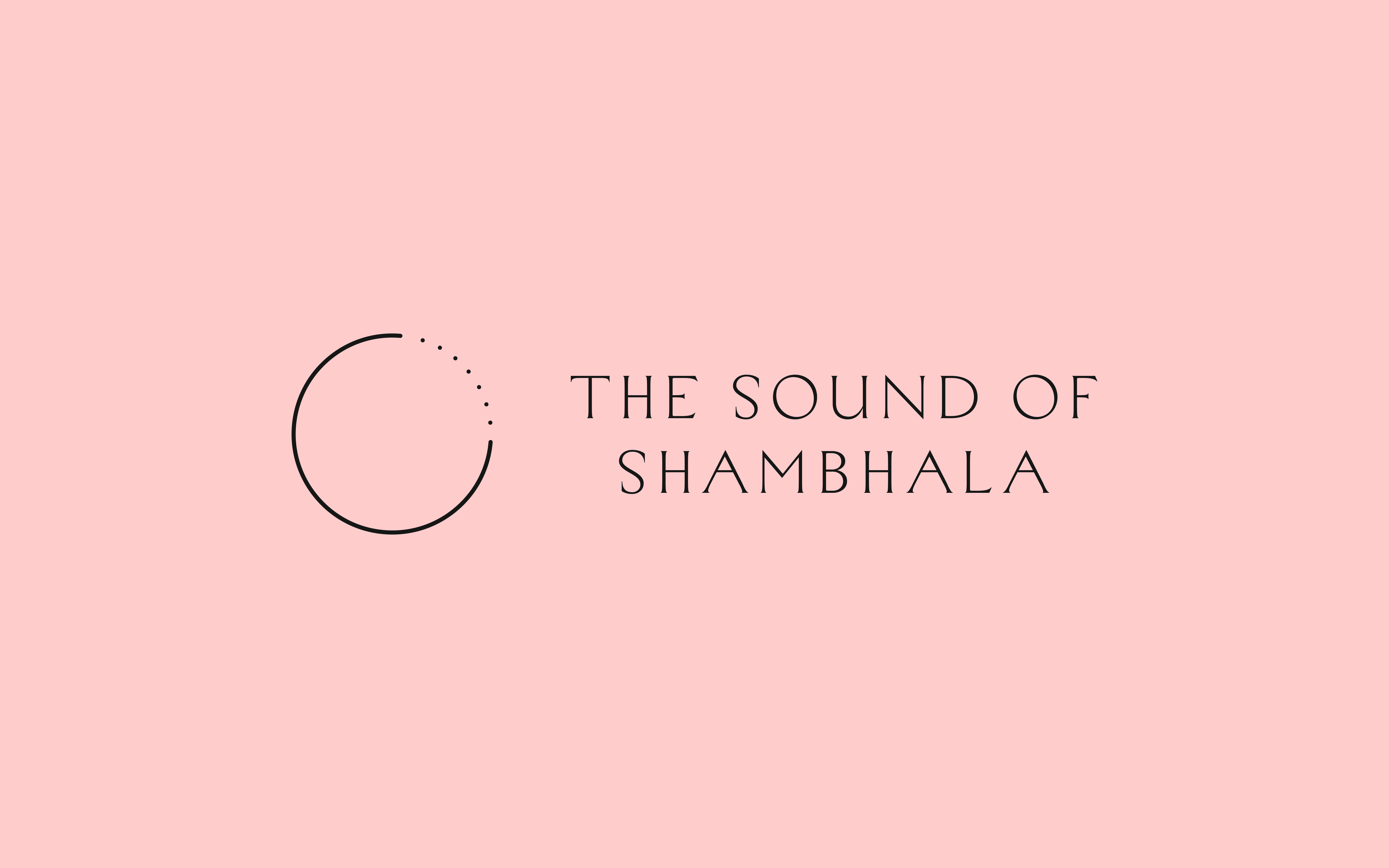

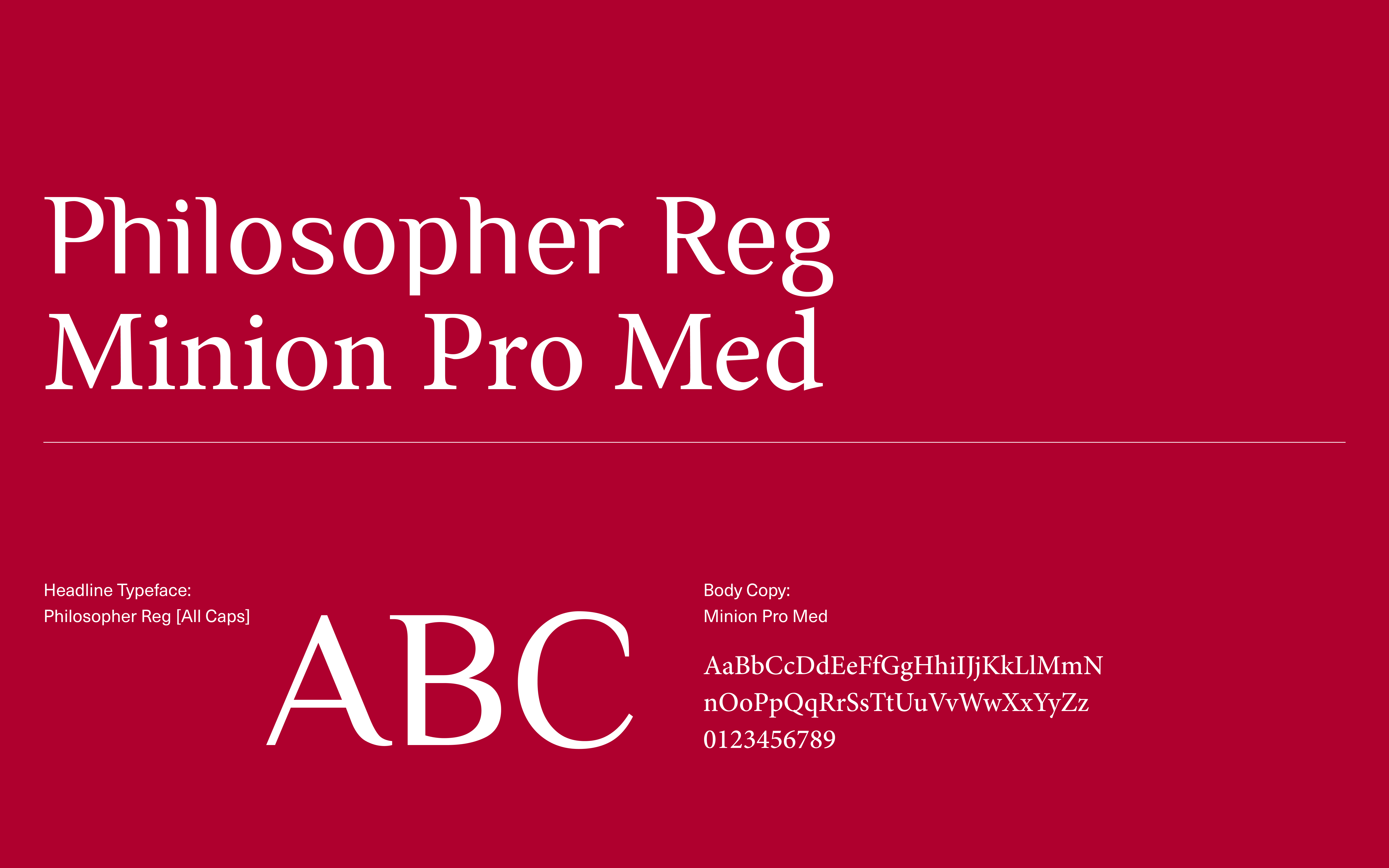
Philosopher's clean lines and rounded edges are modern and approachable, while Minion Pro's classic serif style is comfortable and trustworthy, both echoing the brand's mission of inner balance and harmony.
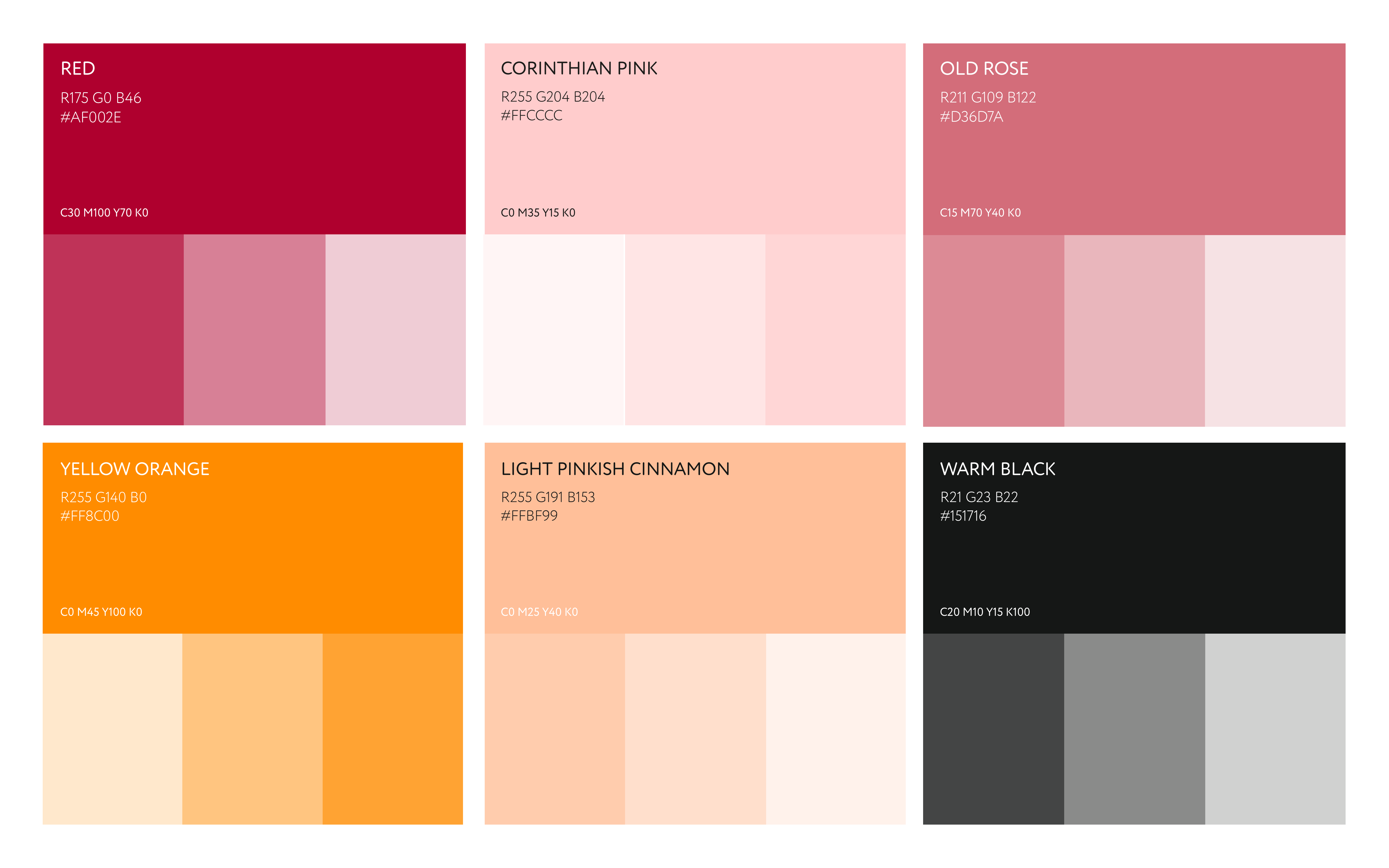
The color palette, curated with warm to vibrant shades, complements the sound healing concept. Each color adds a unique touch - "Corinthian Pink" for serenity, "Red" for energy, "Warm Black" for sophistication, and "Paper White" for clarity.
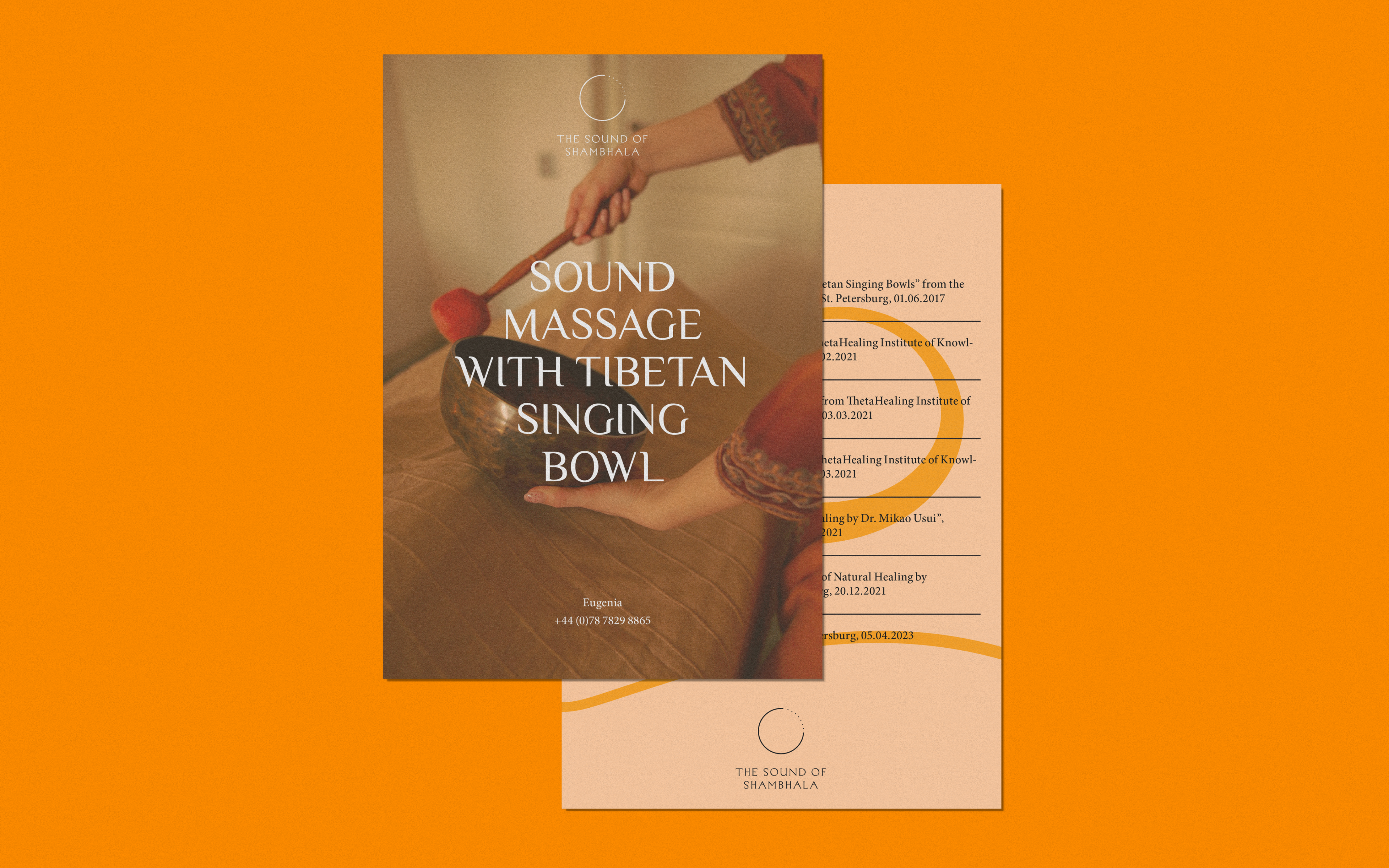
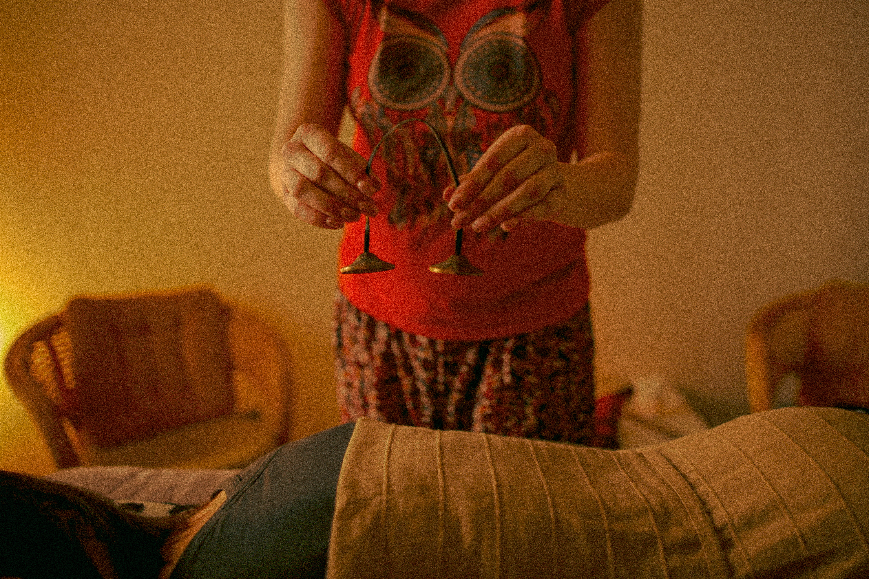
The curated photography, along with warm and inviting colors, creates an inviting and professional atmosphere that enhances Eugenia’s transformative practice.

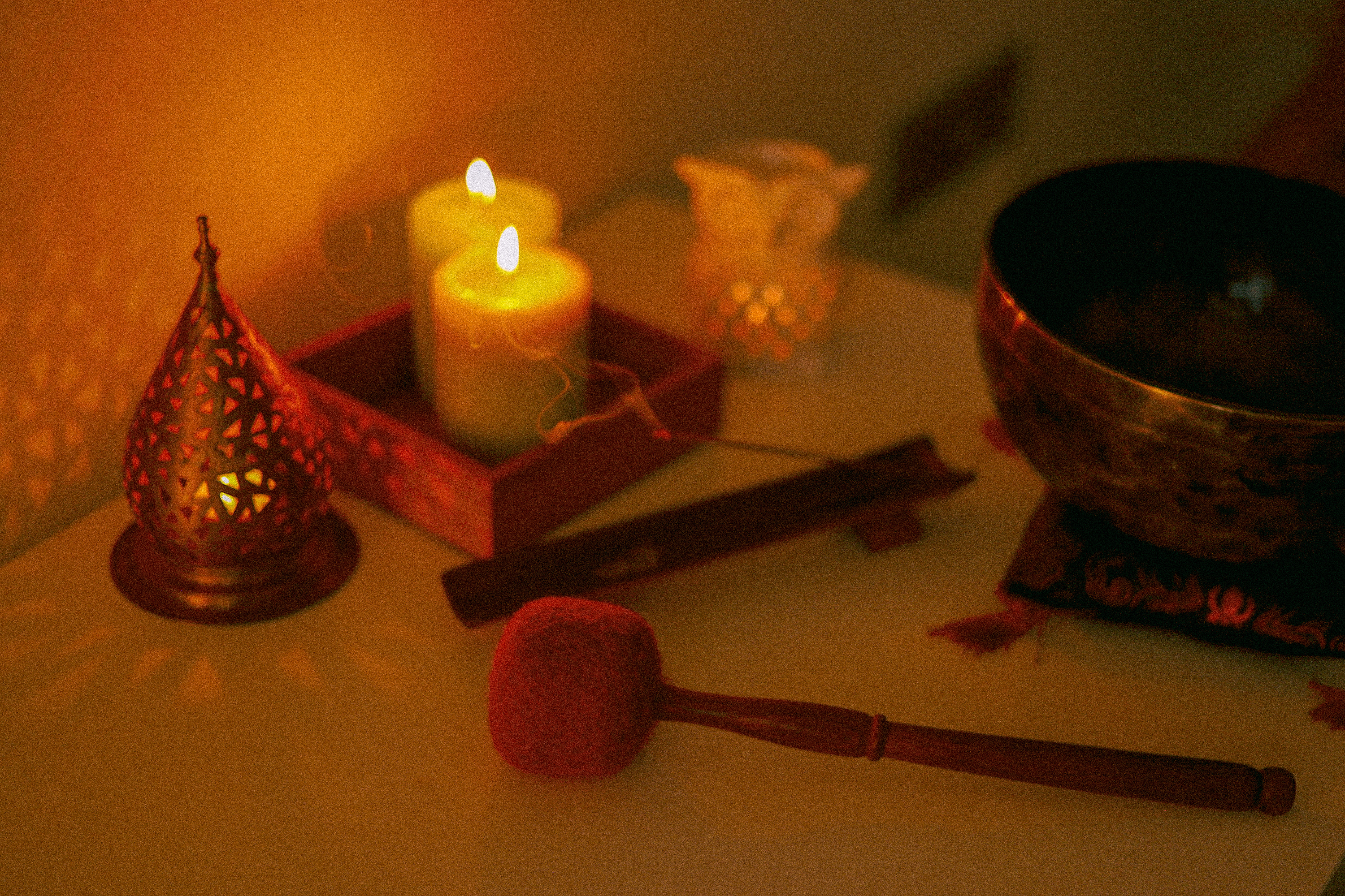


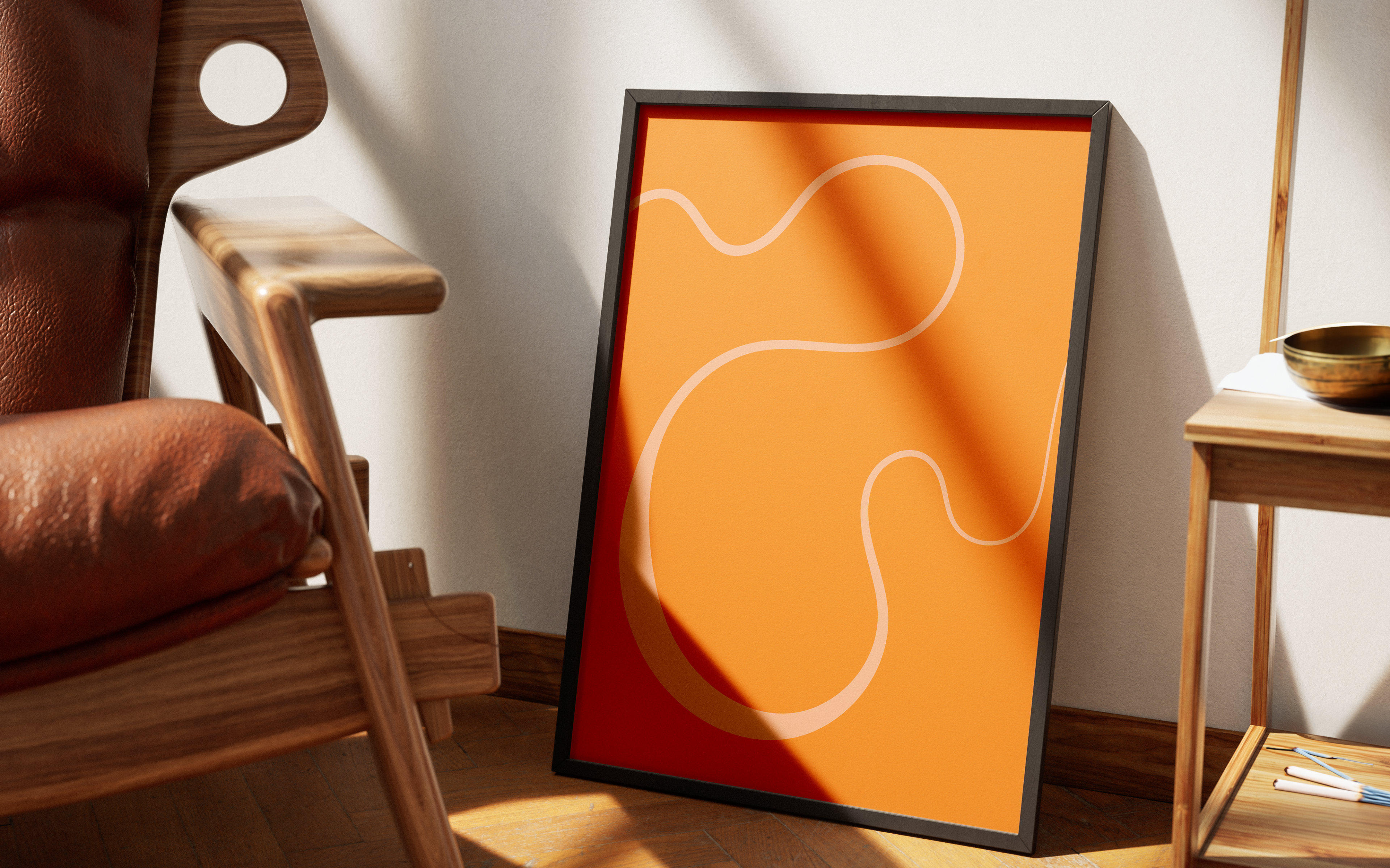
The graphic device, represented by a line with varying thickness, embodies the essence of energy. These patterns artfully convey the fluid motion of the point, the diverse range of energy, and the intensity of sound.


The massage studio project relies on effective marketing through social media posts and A6 flyers. We used a 32-grid field to organise content and ensure flexibility in presentation, while a centralised alignment helped achieve visual balance and harmony.


The branding for Eugenia Alexandrova's sound healing massage practice embodies a profound journey towards inner harmony and balanced energy. Through the fusion of sound massage, Buddhist principles, and Kandinsky's artistic legacy, we have created a brand that stands out and encapsulates Eugenia's vision's essence — to guide individuals towards a state of enduring equilibrium.
Storm: Simplicity and functionality come first.
Client
Storm
Service
Naming, Logotype
Industry
Fashion
Storm
Service
Naming, Logotype
Industry
Fashion
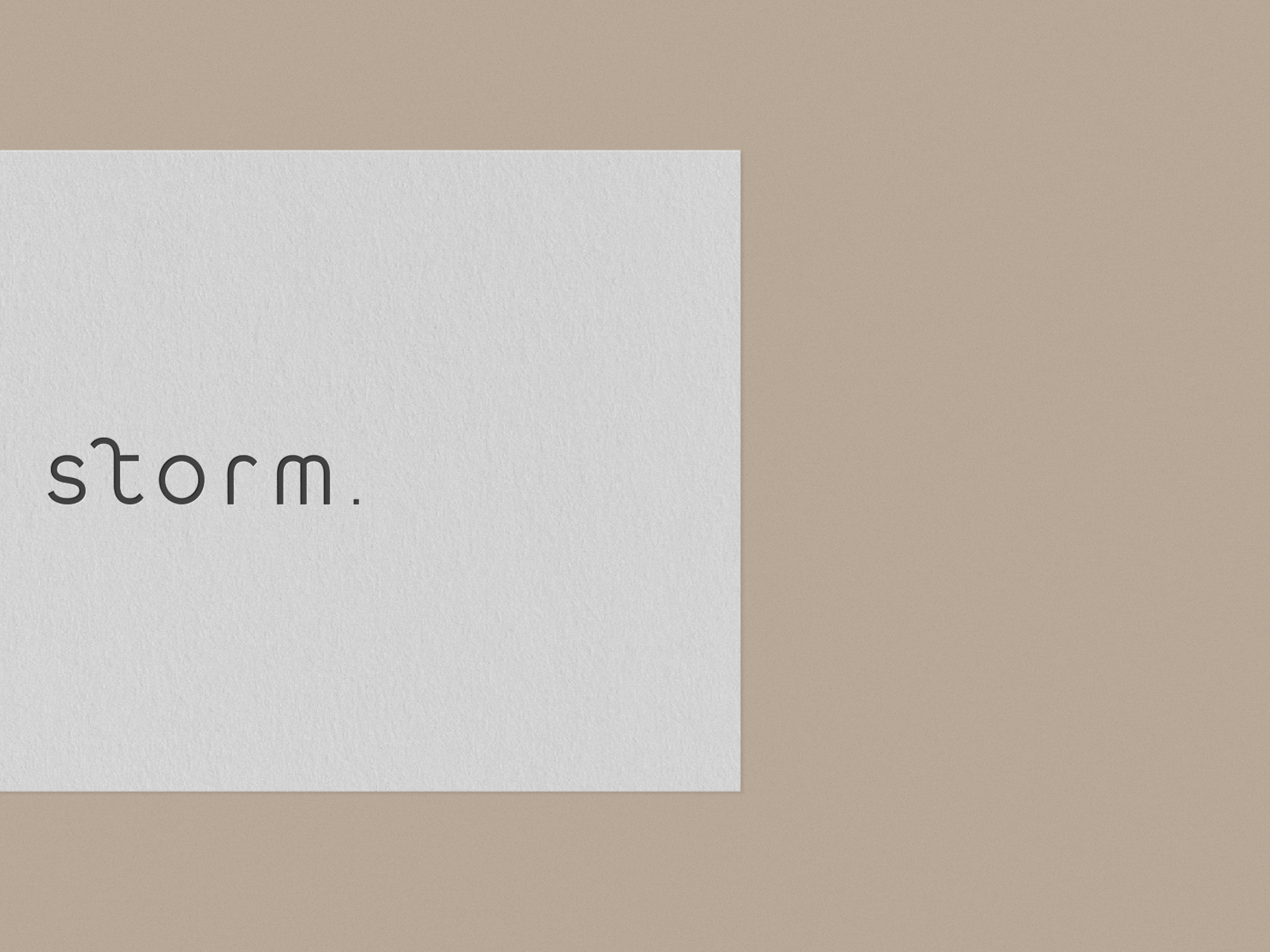
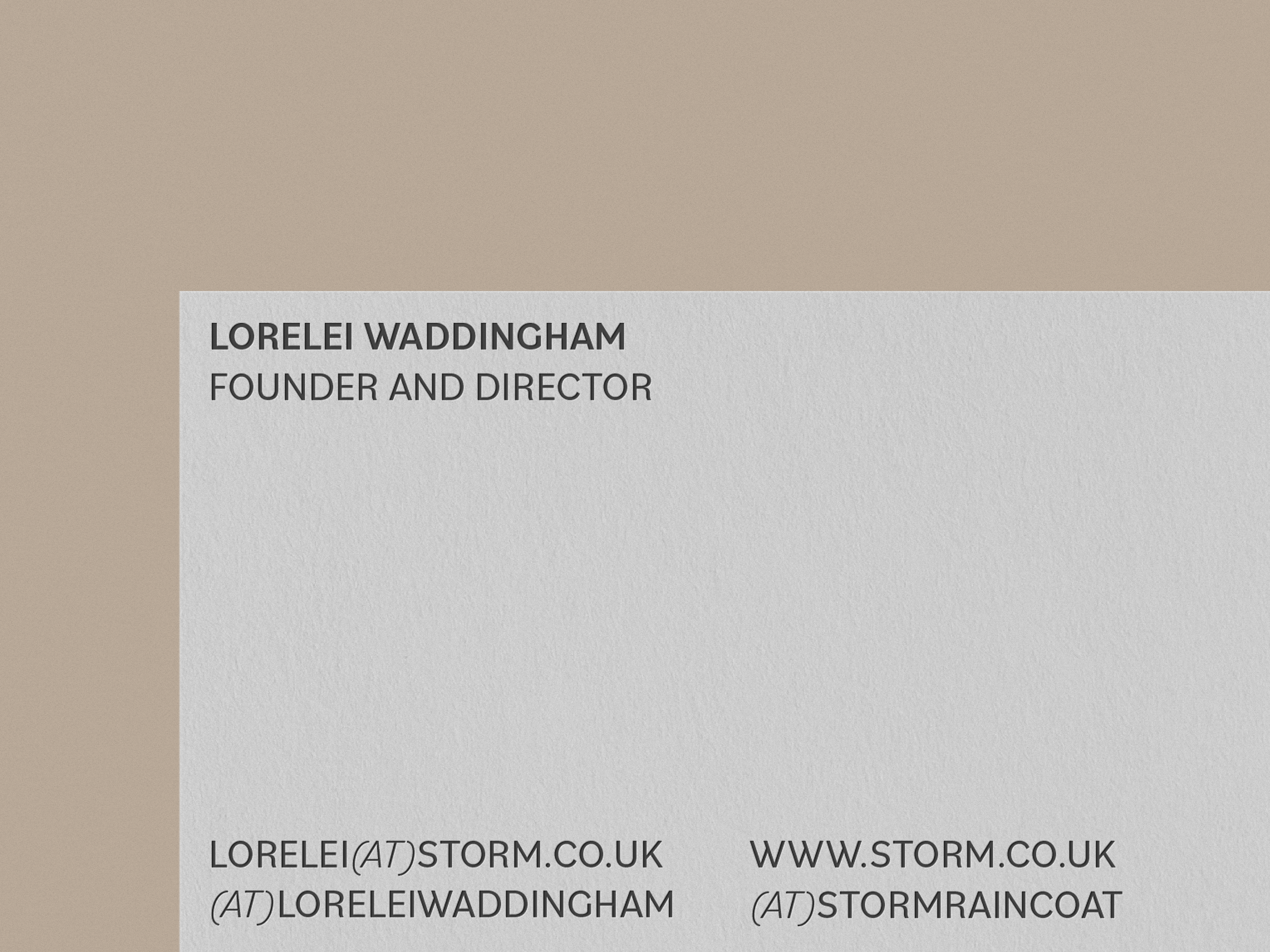
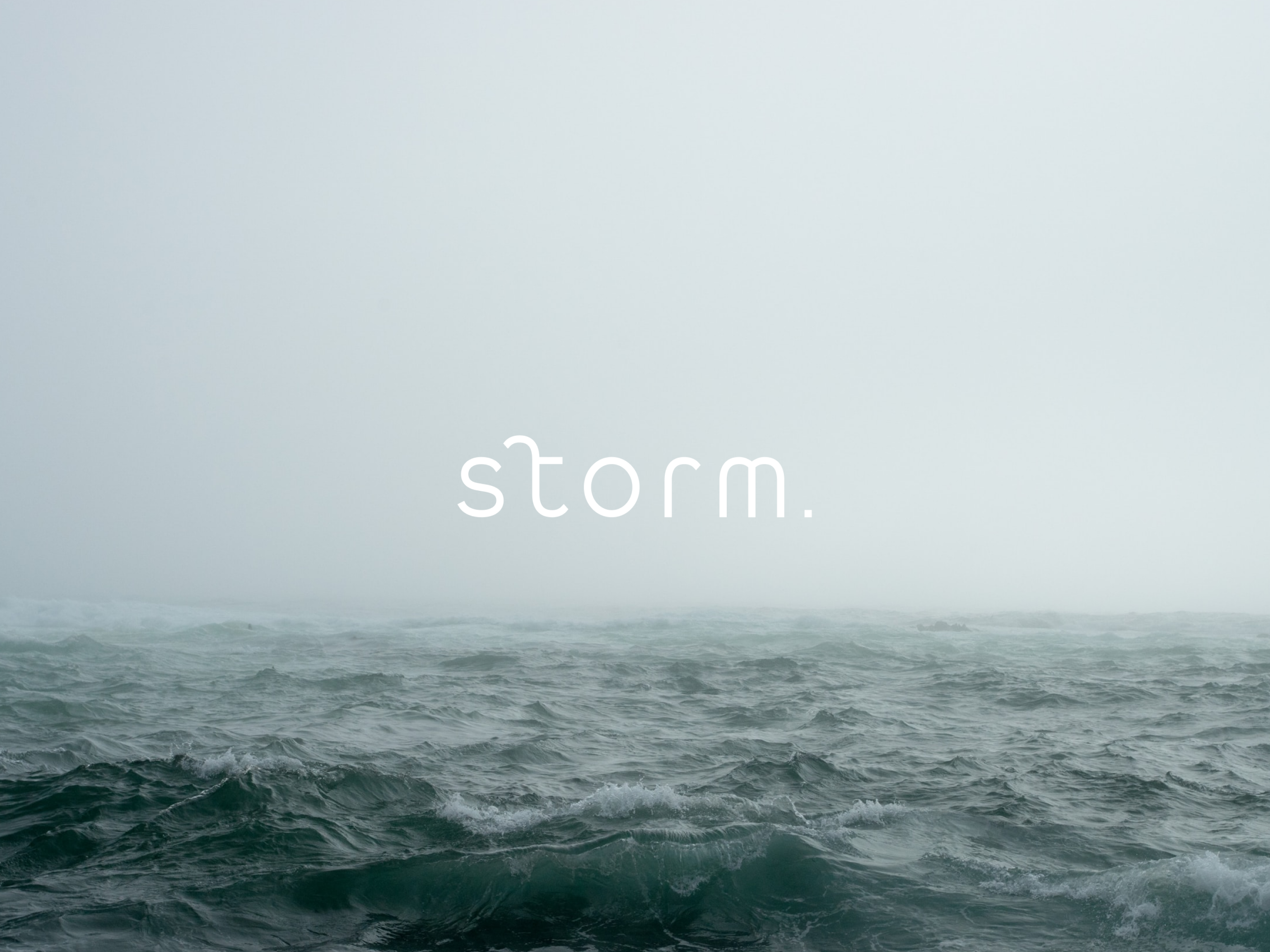
Storm is a brand that creates raincoats specifically for young adults with an emphasis on simplicity and functionality. The brand values versatility, sustainability, and conciseness in its products.
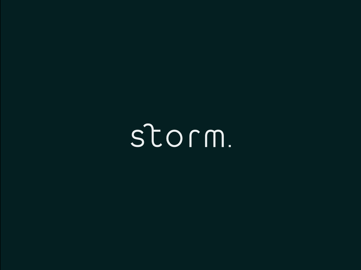
Storm's custom logotype uses a geometric typeface to effectively communicate the brand's values. The second letter's ascender has been customized to add uniqueness, recognition, and playfulness to the brand's perception. The lowercase lettering conveys friendliness, openness, and informality, and the wide kerning gives the overall composition a modern and free look.
Storm's custom logotype uses a geometric typeface to effectively communicate the brand's values. The second letter's ascender has been customized to add uniqueness, recognition, and playfulness to the brand's perception. The lowercase lettering conveys friendliness, openness, and informality, and the wide kerning gives the overall composition a modern and free look.
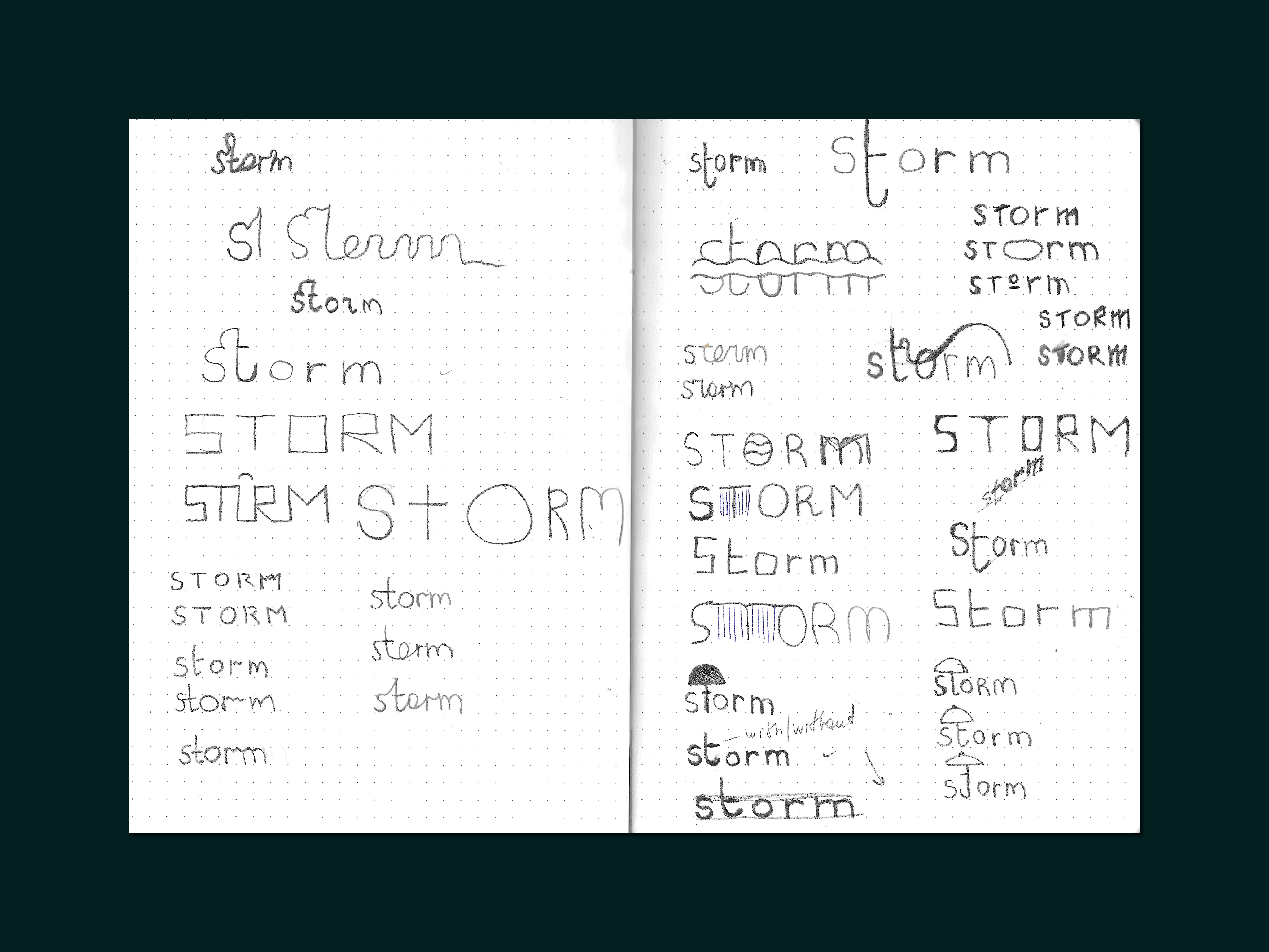

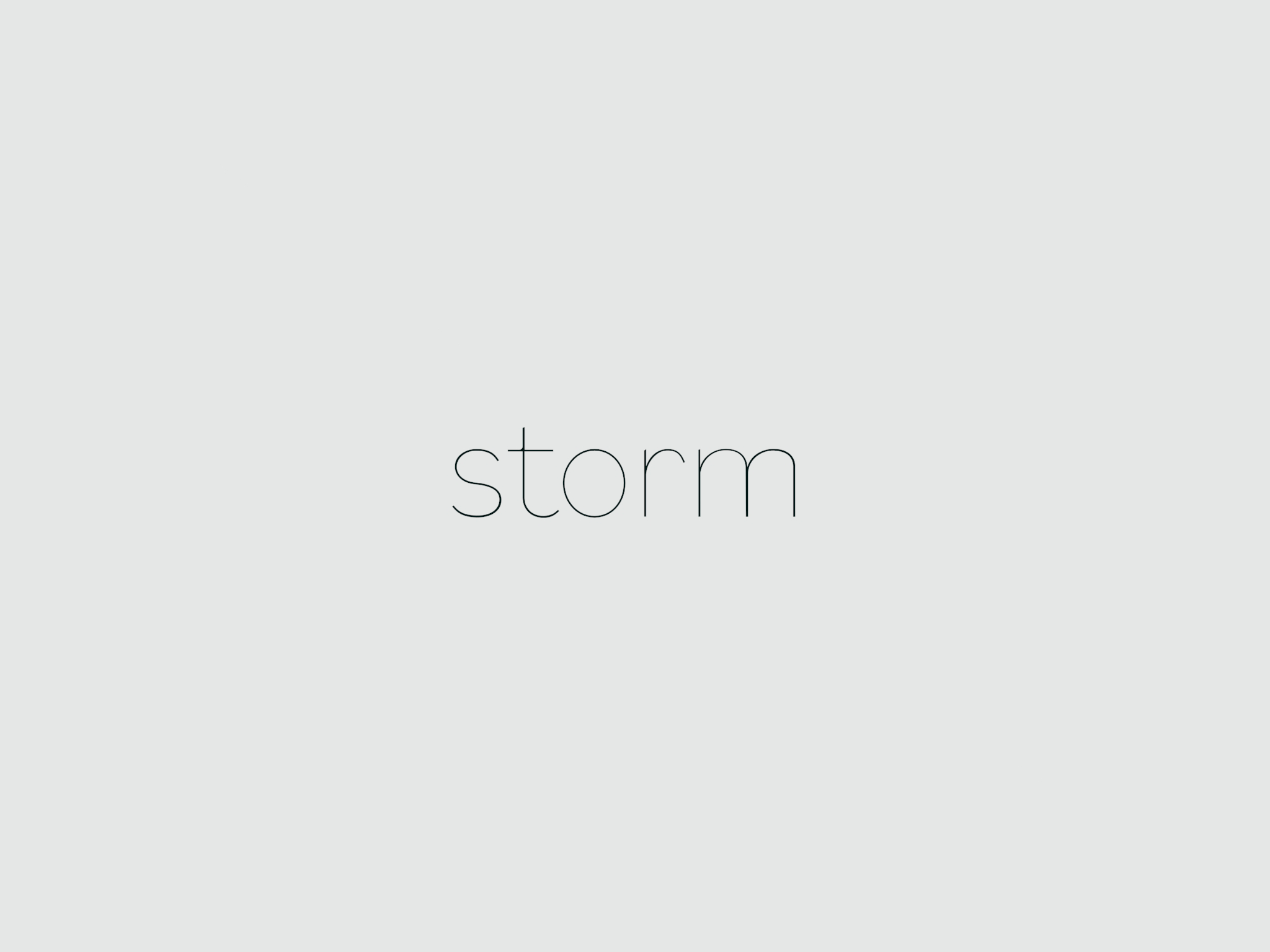
The font used as the foundation is Bilo, which emulates a Bodoni font but without serifs and features organic shapes.