Seized: Compulsive Beauty.

Service
Graphic Design, Photography
Industry
Editorial, Photography
Graphic Design, Photography
Industry
Editorial, Photography
Seized is a self-published photography zine that focuses on a research approach, exploring the Surrealist concept of "Convulsive beauty" through black and white street photography. Andre Breton defined "Convulsive beauty" as a veiled-erotic, fixed-explosive, and magical-circumstantial idea.
The magazine's theme is rather sensitive, so it was important not to lose this sensuality during printing. Therefore, I decided that silk for the inner pages and silk with Soft Touch lamination for the cover would be excellent choices to convey this vulnerable human nature.
Print Specs:
176mm x 250mm
Staple, Full-colour printing, 20 pages, 150gsm Silk
Full-colour printing (front and back), Soft-Touch Lamination (outside), 350gsm Silk
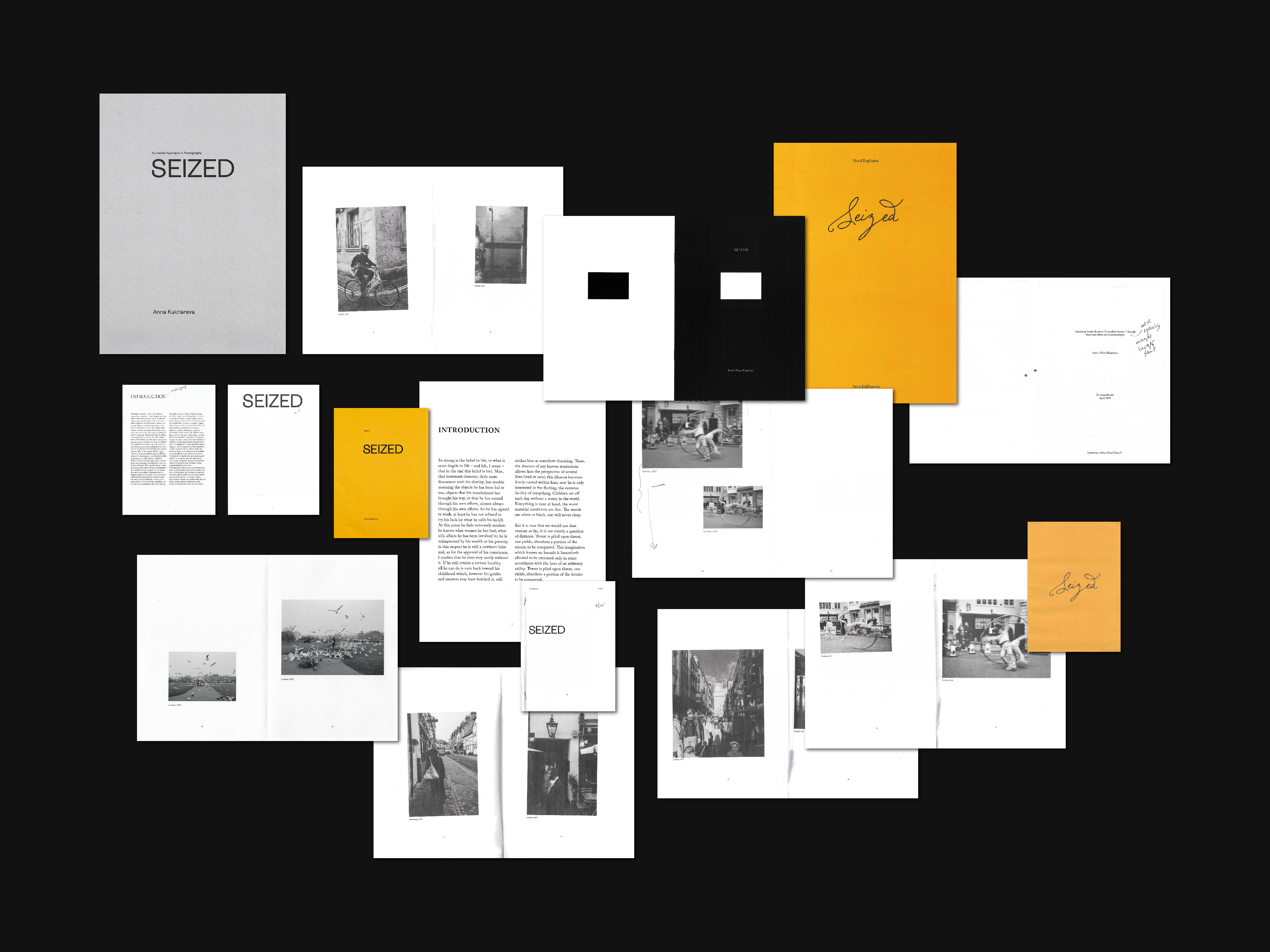
Deciding on the right format for a project can be a challenging task. Both A5 and A4 have their limitations, and it's crucial to find a format that highlights photographs while still maintaining their intimate feel. After careful consideration, I opted for B5 as it perfectly showcased all the images while preserving their intimate feel.
When it came to selecting a typeface, I was looking for a font that exuded warmth, class, and confidence. After experimenting with various options, I settled on Adobe Caslon Pro, which was perfect for publications and offered a suitable range of weights. This chosen typeface was used consistently throughout the entire layout.
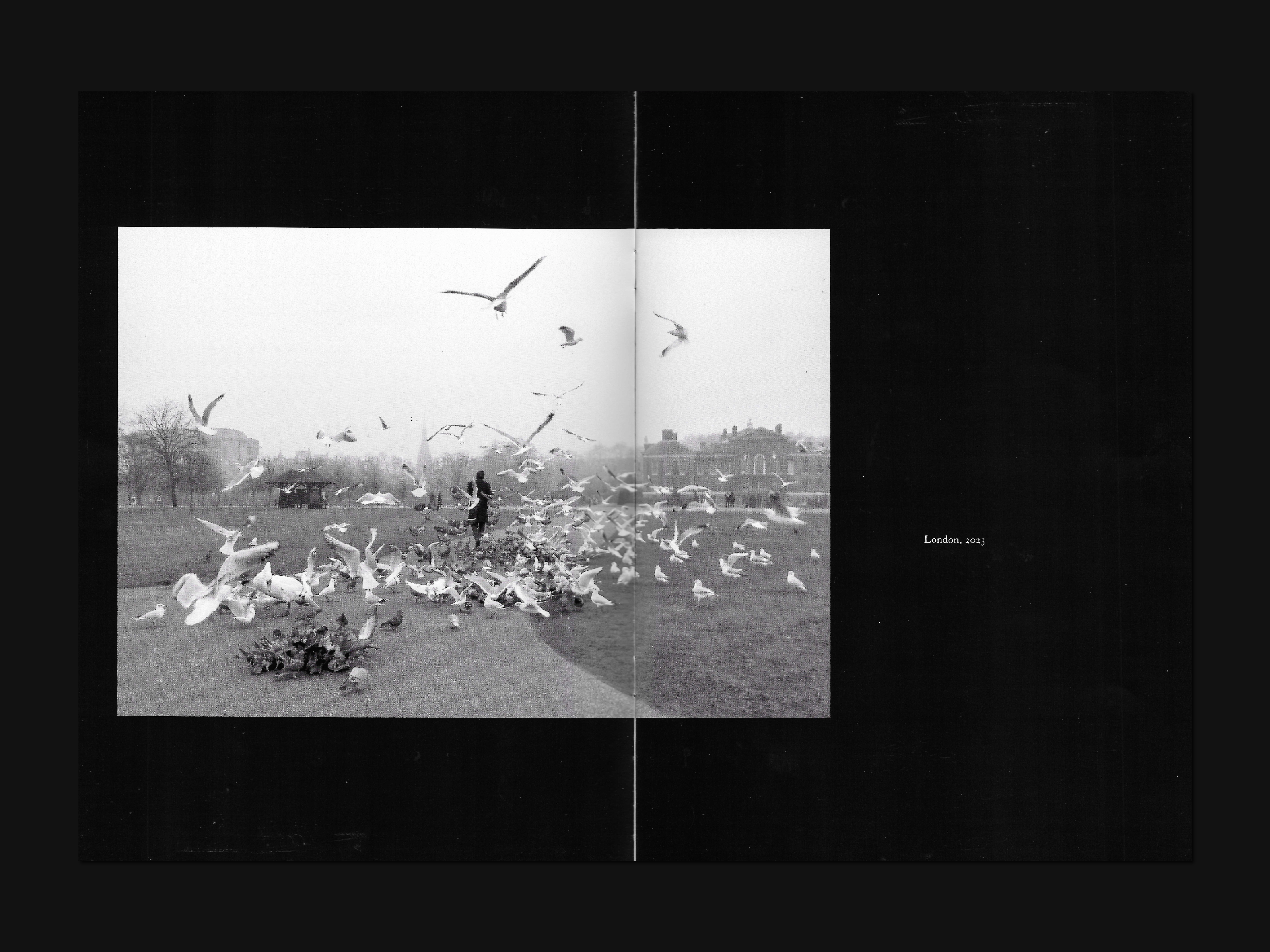
To emphasize a particular emotion, I deliberately arranged one photo per page. Some photos were also allowed to occupy part of the second page to add some breathing room to the layout and to guide the viewer's attention to the most important details of the image or area.
When it came to selecting a typeface, I was looking for a font that exuded warmth, class, and confidence. After experimenting with various options, I settled on Adobe Caslon Pro, which was perfect for publications and offered a suitable range of weights. This chosen typeface was used consistently throughout the entire layout.
To emphasize a particular emotion, I deliberately arranged one photo per page. Some photos were also allowed to occupy part of the second page to add some breathing room to the layout and to guide the viewer's attention to the most important details of the image or area.
For the cover, I wanted to maintain a minimalist approach to avoid any unnecessary distractions and to focus on the key aspect of capturing emotions. Initially, I had planned to use a warm yellow colour to highlight the sensitivity of the topic. However, I ultimately decided to eliminate the use of colour entirely and instead adopt a black-and-white approach, which was also chosen for the photographs themselves. As Henri Cartier-Bresson once stated in an interview with Le Monde, "I find emotion in black and white: it transposes, it is an abstraction, it is not the norm. Reality is like a chaotic deluge, and within this reality, one must make choices that bring form and content together in a balanced way."
After conducting multiple explorations and trials, I finally found what I was looking for in terms of the cover, typography, layout, and colour profile. These choices effectively conveyed the essence of the magazine in the best possible way.
After conducting multiple explorations and trials, I finally found what I was looking for in terms of the cover, typography, layout, and colour profile. These choices effectively conveyed the essence of the magazine in the best possible way.

Issue 1: Fixed-Explosive.
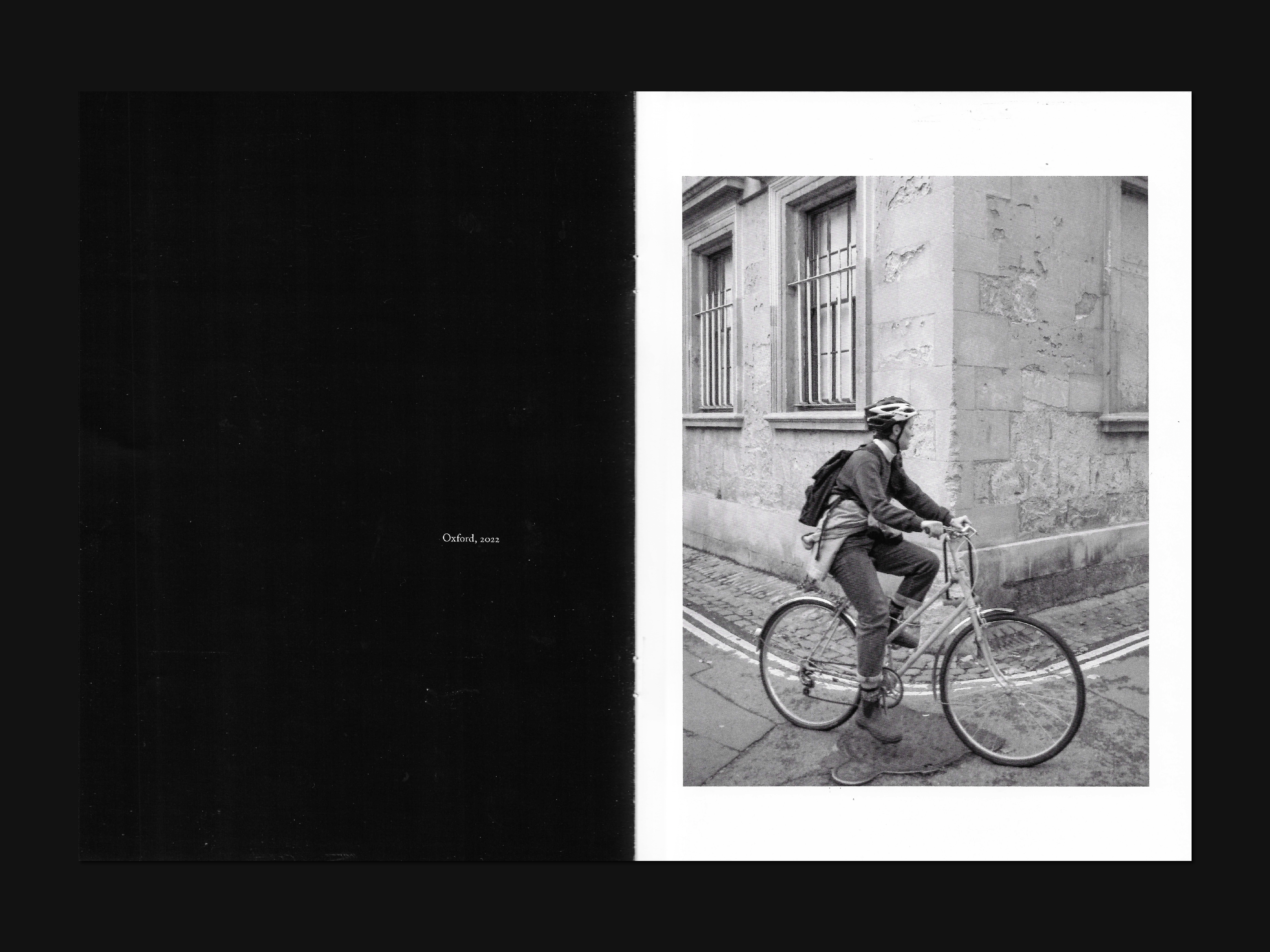
First Seized issue focuses on the "fixed-explosive" concept, where a static image suggests intense movement. The goal is to capture the subject in a static state while also revealing their emotional or unconscious state. By removing control and censorship from consciousness, we allow for a spontaneous and unpredictable creative process.
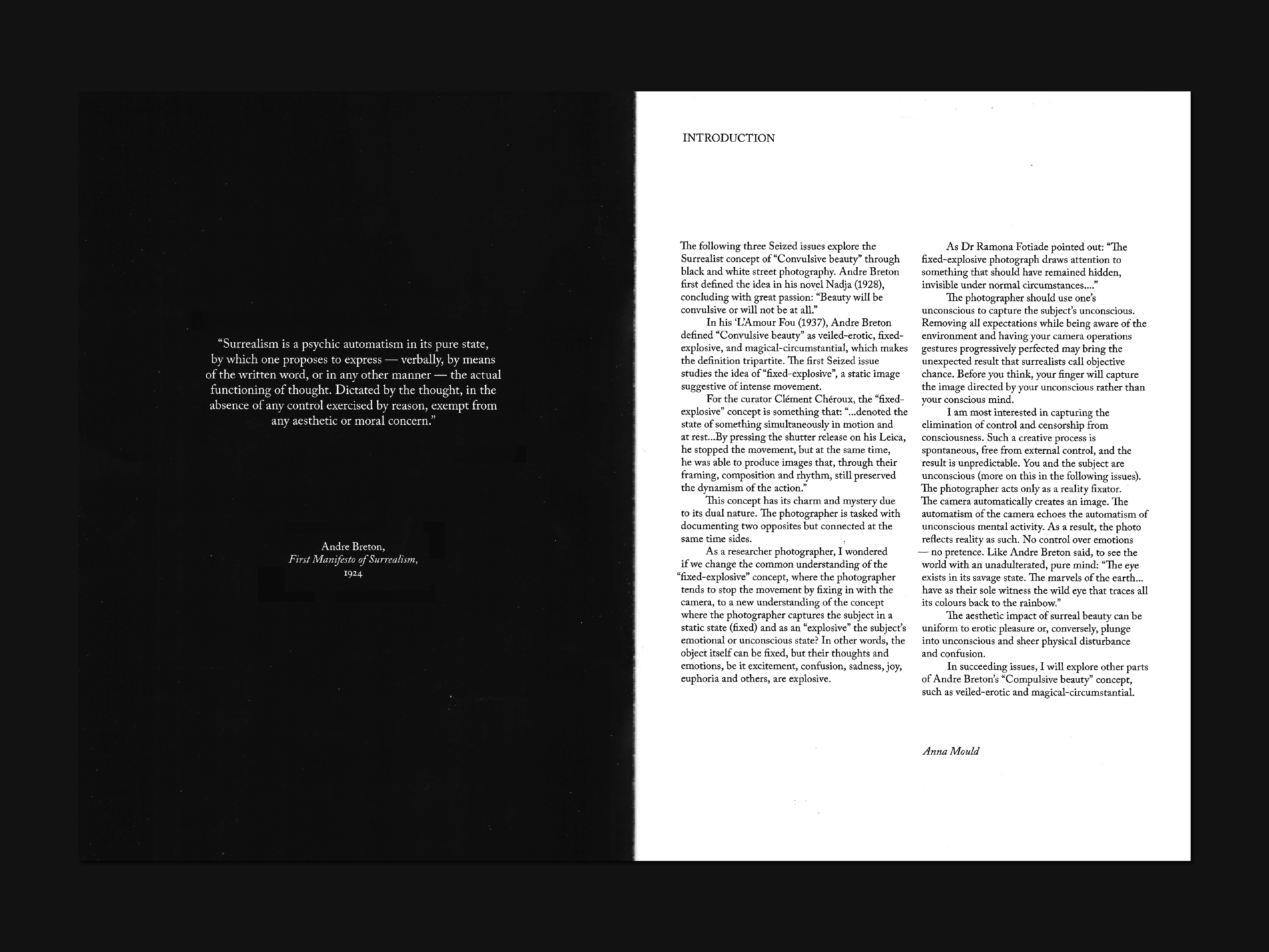


In succeeding issues, I will explore other parts of Andre Breton’s “Compulsive beauty” concept, such as veiled-erotic and magical-circumstantial.