Memories: Aesthetically pleasant experience.
Client
Memories
Service
Branding, Naming, Packaging
Industry
Beauty
Memories
Service
Branding, Naming, Packaging
Industry
Beauty
Our client is an aesthetically pleasant cosmetic brand that covers four major skincare series: cream, moisturizer, cleansing gel and serum. The client entrusted us with developing their new product's brand identity, name and packaging.
The new brand represents young adults who want brands to be environmentally friendly and ethical and want them to connect with a cause or social issue.
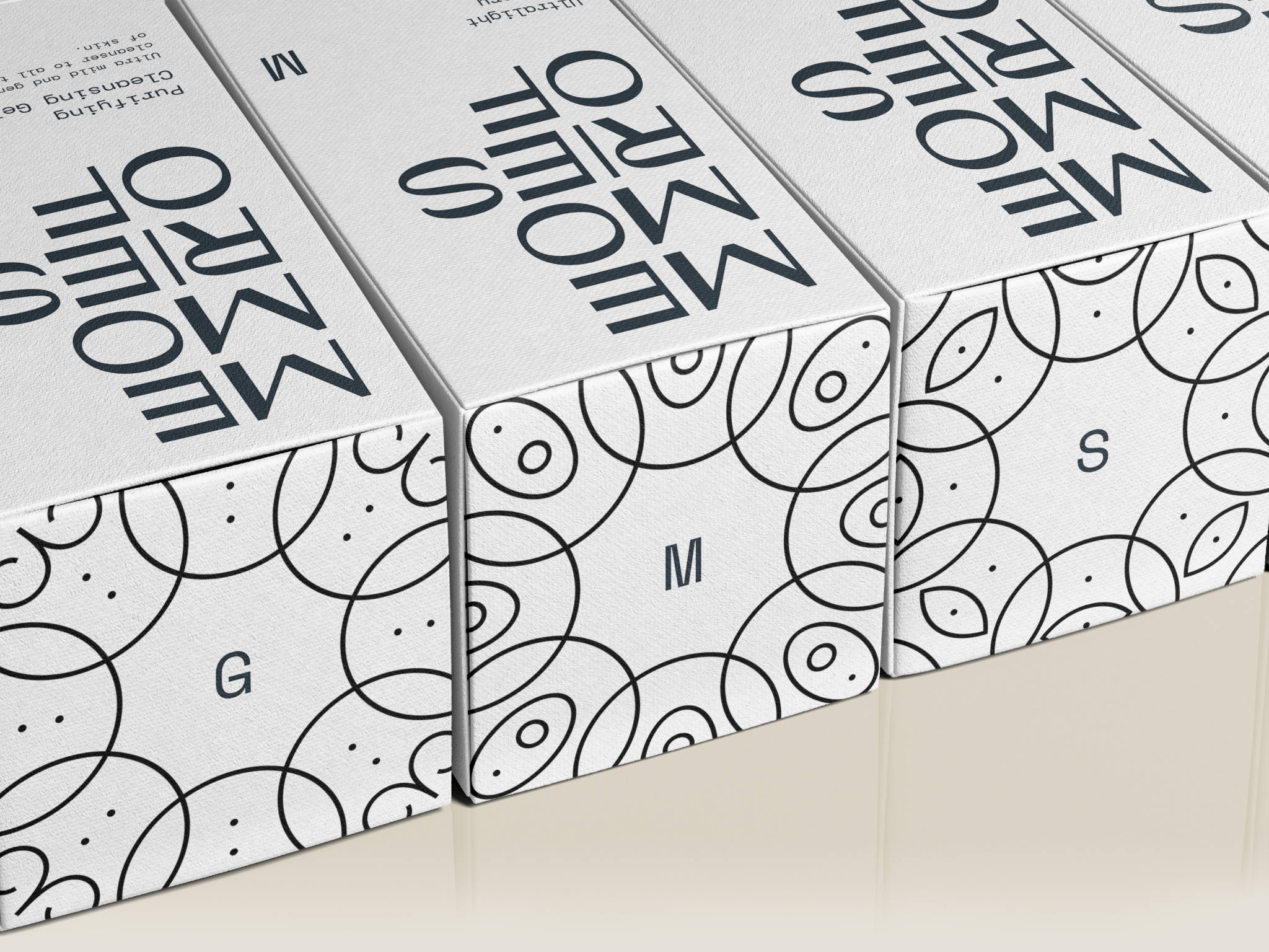
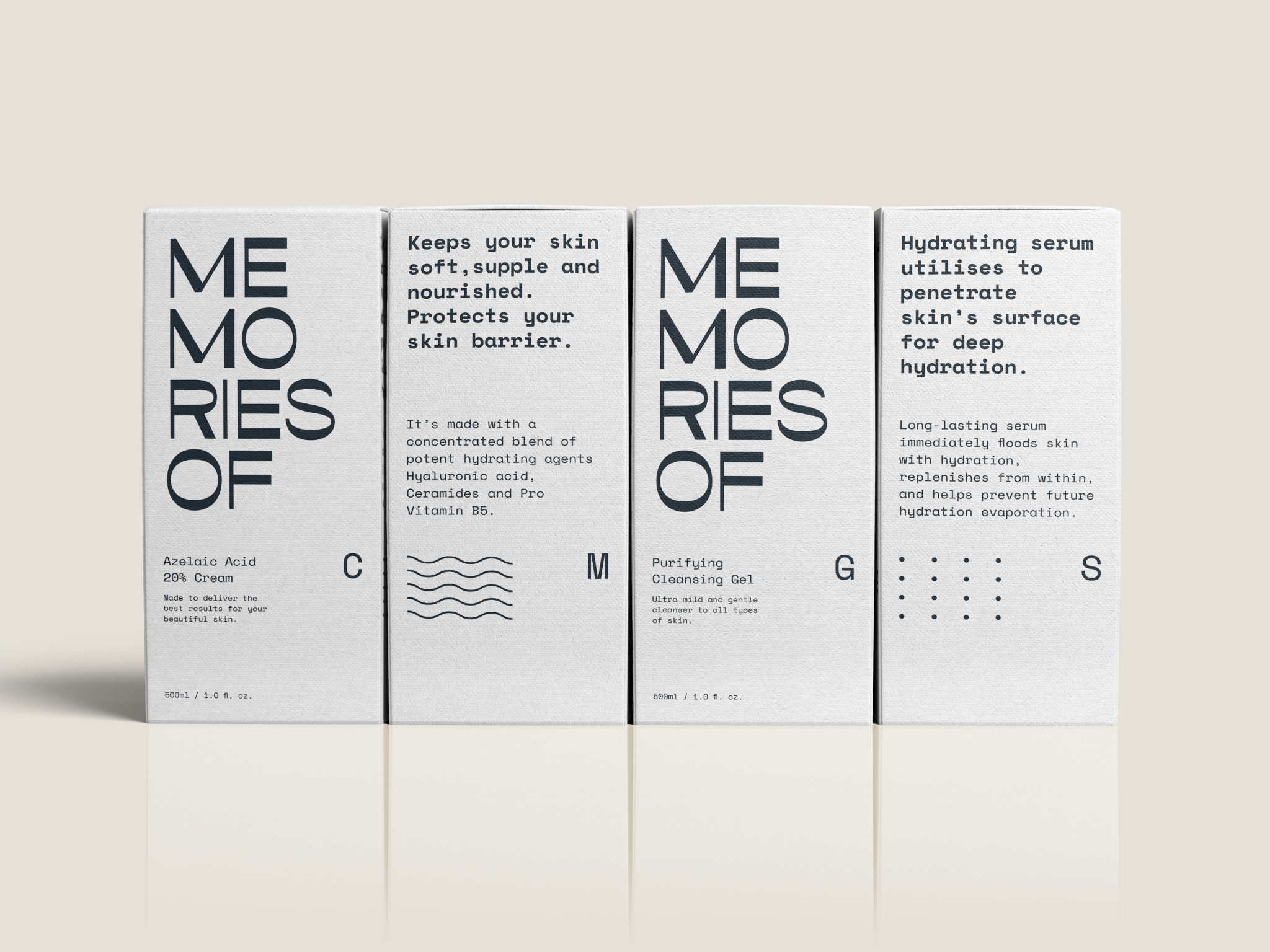
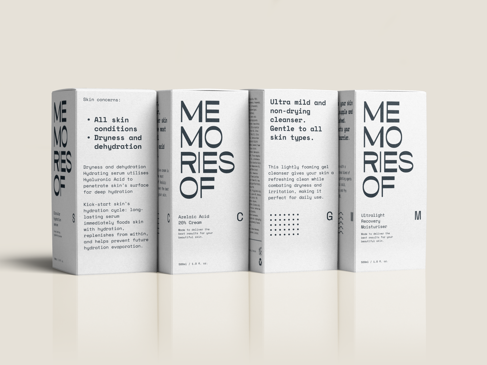
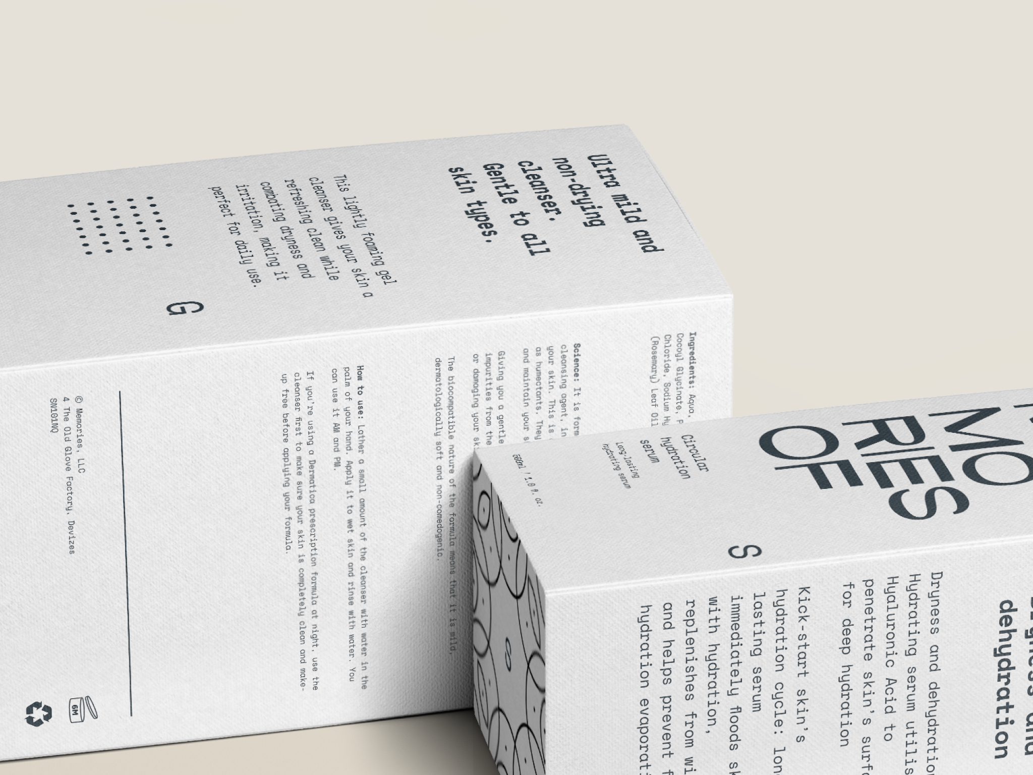
We emphasize the pure, natural, and minimalistic packaging design approach to connect the brand image to the company culture. In addition, we employed white as the primary visual colour in response to the brand appeal of nature and simplicity while full of mystery, memories and possibilities. To reinforce the pure and spiritual image of the brand, we have added geometric illustrations to the design. Each product has its geometric pattern, which adds uniqueness and exclusivity to the product. Each design is geometrically based and built on a structured grid system using repeating patterns that help maintain balance and consistency between shapes. With sans-serif and monospaced typeface selection, we wanted to reflect an innovative approach to self-care and paint a picture of cosmetics with a modern touch.
The outcome is a clean design with a sense of high quality indulgence.
The new brand represents young adults who want brands to be environmentally friendly and ethical and want them to connect with a cause or social issue.
We emphasize the pure, natural, and minimalistic packaging design approach to connect the brand image to the company culture. In addition, we employed white as the primary visual colour in response to the brand appeal of nature and simplicity while full of mystery, memories and possibilities. To reinforce the pure and spiritual image of the brand, we have added geometric illustrations to the design. Each product has its geometric pattern, which adds uniqueness and exclusivity to the product. Each design is geometrically based and built on a structured grid system using repeating patterns that help maintain balance and consistency between shapes. With sans-serif and monospaced typeface selection, we wanted to reflect an innovative approach to self-care and paint a picture of cosmetics with a modern touch.
The outcome is a clean design with a sense of high quality indulgence.


We emphasize the pure, natural, and minimalistic packaging design approach to connect the brand image to the company culture.


With sans-serif and monospaced typeface selection, we wanted to reflect an innovative approach to self-care and paint a picture of cosmetics with a modern touch.


